TL;DR
- Cinematographer Jamie Ramsay calls his collaboration with gaffer Warren Ewing and Company 3 colorist Joseph Bicknell “the holy trinity” of his process for developing the look of “All of Us Strangers.”
- Based on a novel by Taichi Yamada, The Golden Globe and BAFTA-nominated film is directed by Andrew Haigh and features beautifully appointed production design by Sarah Finlay.
- Ramsay and his team created a single overarching look for the two worlds depicted in the film, separated only subtly by the differences between fabrics and dyes prevalent in each era.
- Within that framework, Ramsay’s photography was motivated by the emotional content of each scene, not by opposing looks designed to delineate the different environments.
- Although shot on film, it was still vitally important to develop a LUT to guide the dailies grade so the entire production team could see how materials, skin tones and lighting would ultimately look.
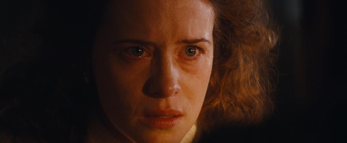
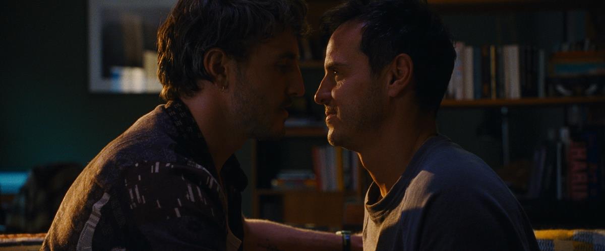
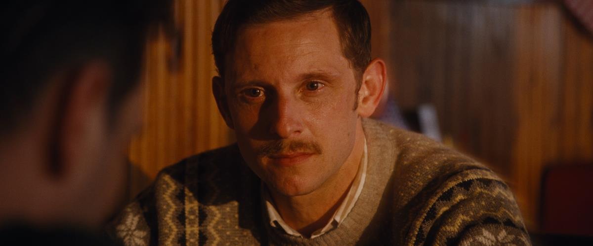
The highly praised Golden Globe and multiple BAFTA-nominated feature All of Us Strangers takes its lead character through some very odd situations that could have been presented in the form of a ghost story but are arguably far more impactful as the intimate drama it is. In the film, we meet Adam (Andrew Scott), a writer who has the opportunity to better understand his fears and the reasons for his loneliness when he visits his long-deceased parents (Claire Foy and Jamie Bell) and has a chance encounter with a handsome but mysterious stranger (Paul Mescal).
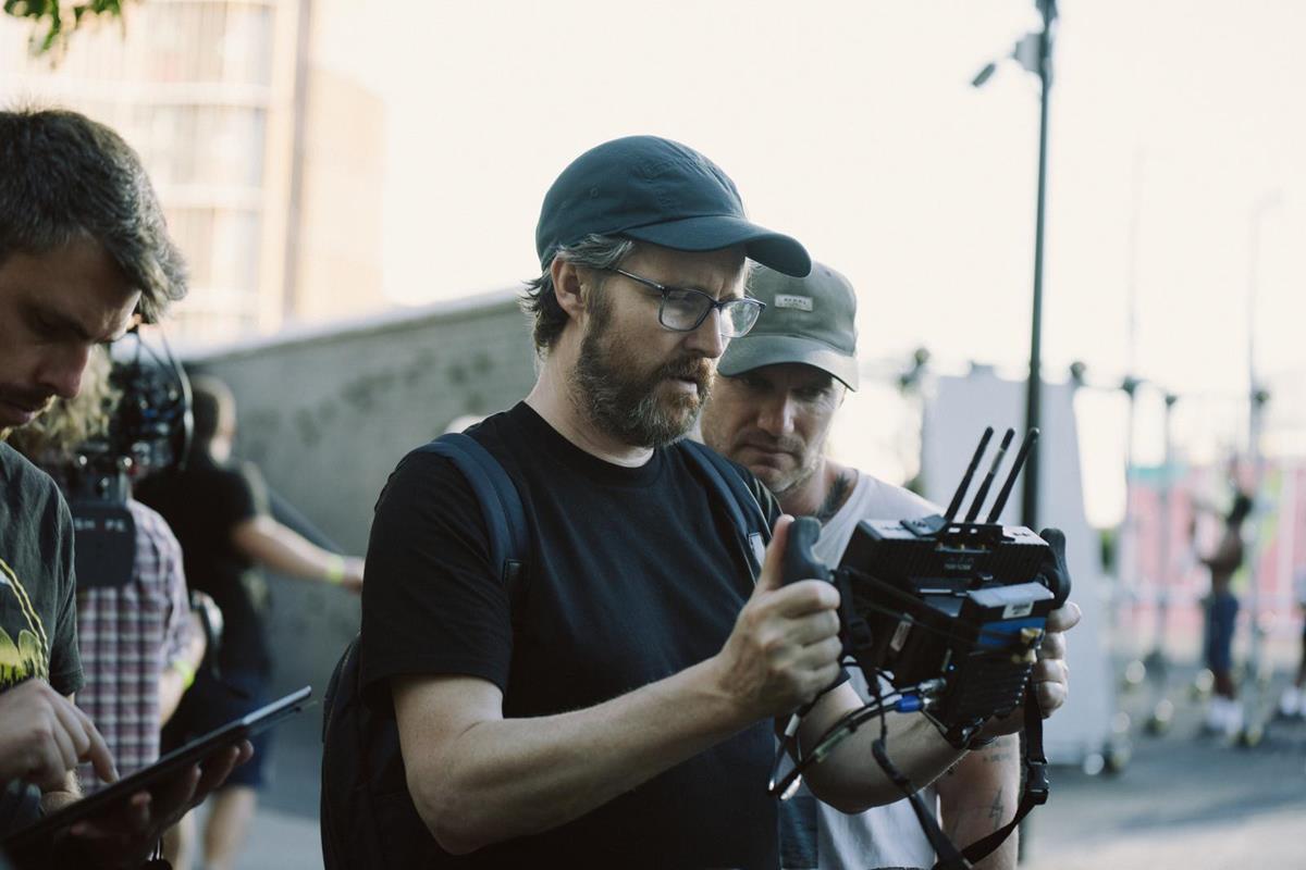
In addition to Andrew Haigh’s direction and script (based on a novel by Taichi Yamada), the fine acting and Sarah Finlay’s beautifully appointed production design, the film’s unusual approach succeeds in large part because of the work of cinematographer Jamie Ramsay — work that began long before shooting commenced.
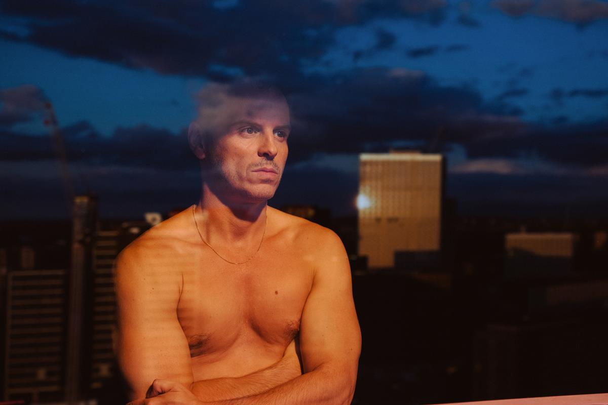
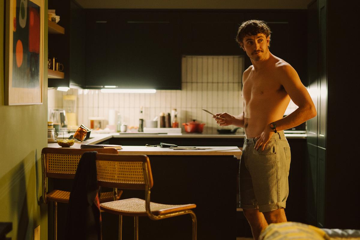
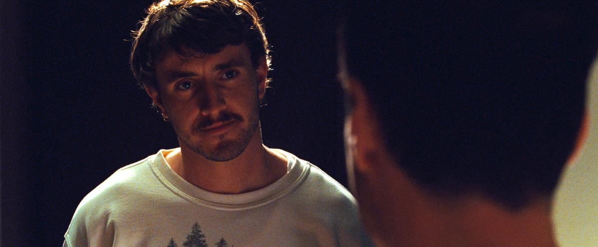
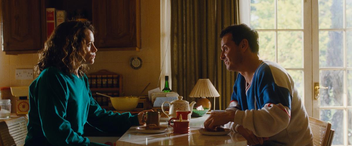
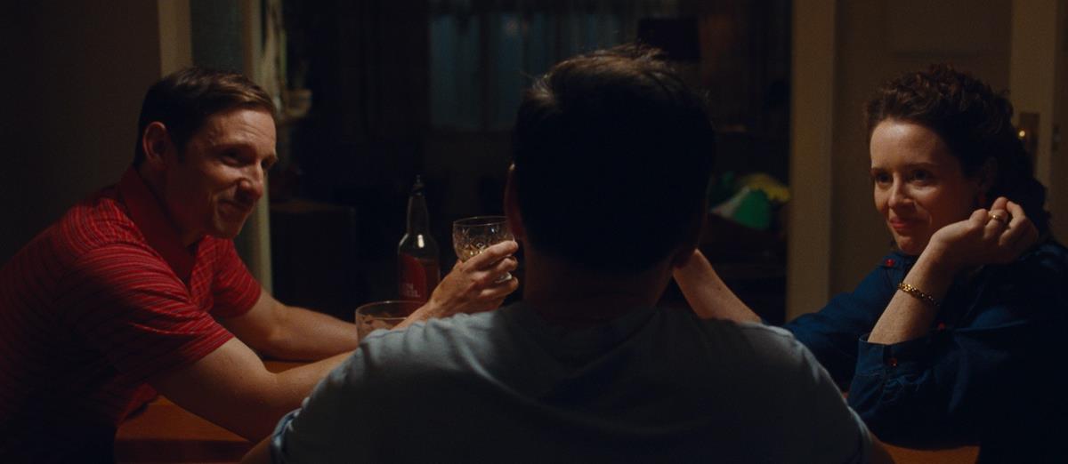
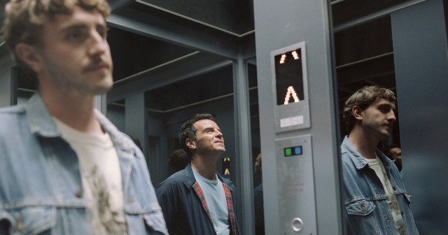
A key to the film’s overall visual tone concerns the look of Adam’s contemporary London apartment, which suggests a somewhat luxurious space with a lovely view of the city but a rather sterile, lonely space, versus his parents’ suburban home, which evokes the era of the 1980s, when he’d last seen them, and feels a bit more inviting.
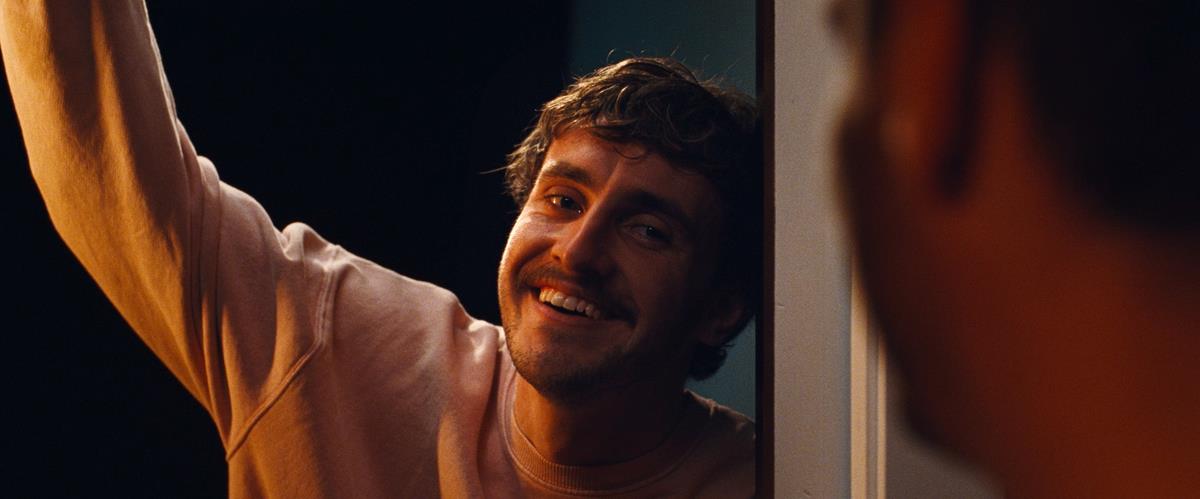
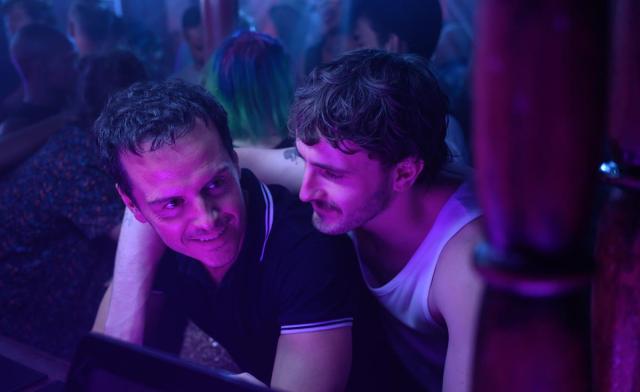
Early on, the question arose of whether the cinematography would offer a clear delineation between these two worlds, with the past looking warm or hazy perhaps and his modern world colder? No, Ramsay says. The overarching look would be similar between the two worlds, separated only subtly by the differences between fabrics and dyes prevalent in each era. Within that framework, Ramsay’s photography would be motivated by the emotional content of each scene, not by opposing looks designed to delineate the different environments.
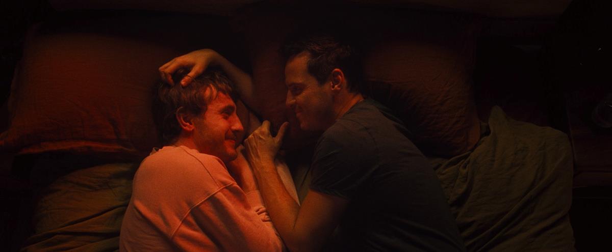
“Once I’ve had these types of conversations with the director and production designer,” he says, he starts to build a look book of “color treatments, images, textures, tones and thoughts that encapsulate moments and anchor points in the story and how colors should shift and by how much.”
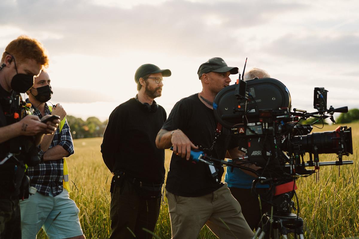
Then, Ramsay starts the process of developing an approach for the cinematography itself and this is when discussions expand to include gaffer Warren Ewing, who will oversee the type, intensity and placement of lighting units based on Ramsay’s ideas, and colorist Joseph Bicknell of Company 3, who would work with the cinematographer to develop a show LUT which reflects the story’s concepts and provides a visual representation to everyone involved in shooting editing the film, how color and contrast will be rendered in the final film.
This threesome comprises what Ramsay refers to as “the holy trinity” of his process. “Color, light and texture and the mood and emotional and intellectual context created by color is so important to a film,” he explains, “and the relationship between my colorist, my gaffer and myself is key to how we bring all that to life.”
Though Ramsay shot All of us Strangers on film, it was still vitally important to develop a LUT that would be used to guide the dailies grade so that everyone involved, from the director to production and costume designers and, of course Ewing, could all see how materials, skin tones and lighting would ultimately look.
“We wouldn’t see [the results of the LUT] on set as we would if we were shooting digitally,” Ramsay explains, “but it was important to do this work in advance so that everyone could get a good idea of what the LUT would do so we were all on the same page,” he says. “After the first week of shooting, one of the most important things we did was having a big-screen projection of some of the choice dailies.”
Creating the LUT involved shooting tests on various Eastman Kodak emulsions, which Ewan lit, and Bicknell graded. “We could [test] production design and wardrobe design and color palettes and various materials and tonal boards and really see the see where the colors go,” he says. He and Bicknell worked with the film scans at Company 3 to design the show LUT. “And from that, we can see where we will need to push and pull colors. Do we need to wash a color down a little bit or keep it where it is?”
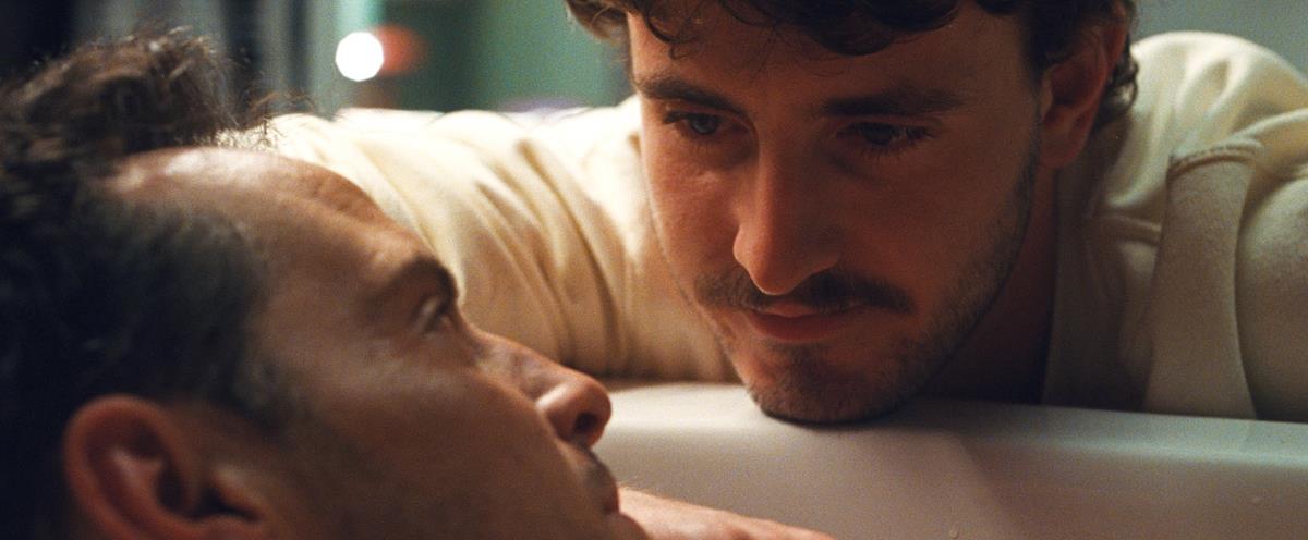
Communication among the DP, gaffer and colorist from this early stage, Ramsay says, helps to ensure control over the imagery as Ewing and Bicknell compare notes on how “the quality and intensity of the light on set interplays with the handling in the grade of the contrast and the placement of blacks and highlights within the frame.”
So much of the film is ultimately about the gravity of the loss that Adam suffered when his parents were killed in an accident and much of what Ramsay endeavored to create was based on the idea of the character’s memories. Portions of the film were designed to feel “almost like a time capsule in the sense that Adam’s parents were locked in this point in time in the late ‘80s.”
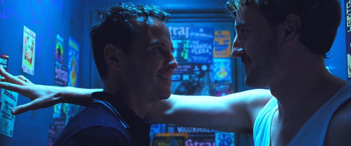
This didn’t mean that the show LUT should bring an overarching ‘80s feel to everything, though. “We wanted to be able to evolve the color in such a way that there could be a growth to it,” the DP says. “So, for instance, in the current day costume and production design choices would include intense primary reds while the ‘80s reds would be more like a burnt orange. A primary green would be more of a pistachio. And so on. So, the relationship of color and time was dealt with on the set.”
When Ramsay and Bicknell worked on the final grade, a great deal of the look of the film had already been worked out in the well-thought-out interplay between the lighting, design and the show LUT. Says Bicknell, “I love working with Jamie as we have a lot of the creative conversations and world building in preproduction, and that allows us to be inspired by the changing emotion and tone of the film in the final DI, helping to advance the story with color.”
Quite a bit of suspension of disbelief is demanded from the audience, the DP says, “but we all believed that if we gave the audience the respect — if we gave them a tableau that felt honest and truthful and real — that would serve us, because it would just put the responsibility in their hands just to just stay with the flow.”

