TL;DR
- Cinematographer Erik Messerschmidt details his latest collaboration with David Fincher on “The Killer,” featuring Michael Fassbender as an assassin with sociopathic personality traits and an attention to detail that leaves nothing to chance.
- Featuring an avocado-colored LUT, exquisite scene management and meticulous coverage, Fincher’s edict for “The Killer” was always to control the pace.
- Multiple Paris interiors were constructed on sound stages in New Orleans in a series of three-walled sets that the actors were able to walk through.
- The production shot practically whenever the outcome could be controlled, but lens flares and other digital effects were created during post-production.
- A momentous fight sequence appears to have been captured using handheld cameras, but the footage actually had de-stabilization applied in post.
NAB Amplify caught up with cinematographer Erik Messerschmidt just as he was about to fly to the Camerimage film festival in Poland, where Ferrari, his first film with director Michael Mann, was in competition. “An extraordinary experience, once in a lifetime,” was his on-the-spot reaction to the question, “How was it?”
But we wanted to talk to him about The Killer, a Netflix movie with an appearance in selected theaters at very selective times. Most people would wait for the stream and live with the Internet compression artifacts for the treat of a Fincher film, this time about a man who kills for a living. Cue Michael Fassbender, with sociopathic personality traits and an attention to detail that leaves nothing to chance; some reviews suggested that this man was a depiction of Fincher himself.
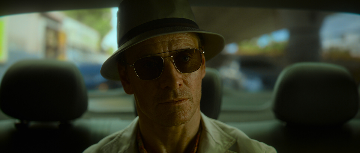
If you have seen previous films or television shows from the Fincher/Messerschmidt duo, especially 2018’s Mindhunter, you would be in a comfortable place from the get-go of The Killer: An avocado-colored LUT, exquisite scene management, and meticulous coverage. “Is this all you?” the DP was asked.
“It’s a thing that David and I do together. I enjoy the process of camera direction; I view it as sort of my principal job, really. It’s thinking about the structure of the film and of each scene. Every director’s interaction in terms of coverage and camera direction is different. It’s the first thing David and I discuss: structure and pacing. It’s almost an editorial conversation in terms of what we’re going to provide Kirk [Baxter, the editor] and how each scene breaks down in terms of the pace,” he said.
“Then we watch the rehearsal, and I watch what he’s doing with Michael and what Michael’s doing. We look for the moments we need: the wide shots, the single setups, and what we need to address them. It’s quite scene-specific, but the edict on this movie was always to control the pace.”
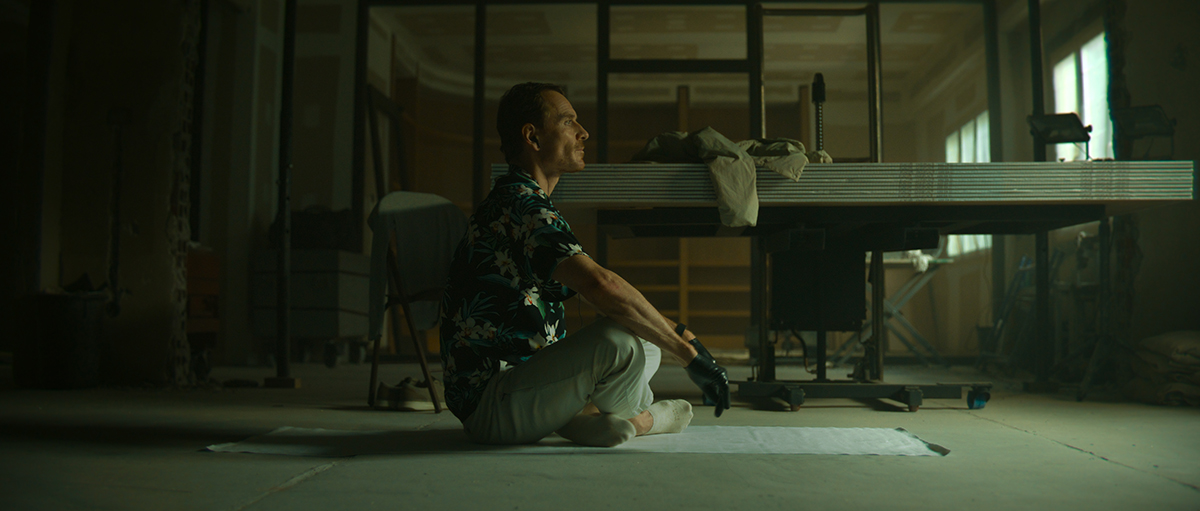
When watching a Fincher movie, the joy is giving in to that control and mastery. For instance, when the killer is preparing for a hit, the pace differs from when it all goes wrong, and then that comforting LUT and algebraic camera direction deforms into something less exact.
“When we’re in the killer’s space, the camera is precise and classic. When his world falls apart and he’s no longer in control, then the camera follows suit,” says Messerschmidt.
But any comfort you may feel, especially in the first 20 minutes of the movie, is a ruse and preparation for the ride to come. Messerschmidt explains their methodology, “We’re not and never are pointing the camera at action. We’re — especially with David — quite concerned about using the frame to provide information for the audience. Those things can exist at the edge of the frame, at the center of the frame, and the relative depth sort of correlates to their importance,” he says.
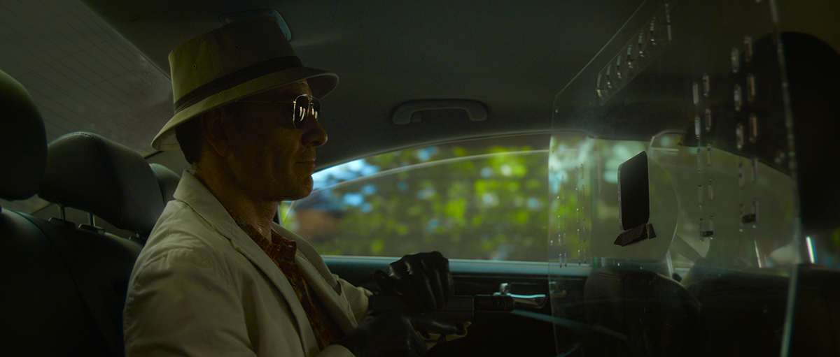
“We’re quite cautious about the art direction and the composition of each shot with consideration about how we’re spoon-feeding that information to the audience. It’s like, ‘You need to see this now, so we’ll include it in the frame; you need to see this reaction, so it’ll be in a close-up.’ So you need to see what he’s looking at so you’ll be in a point of view,” the DP continues.
“That all comes from a place of blocking, really. The way that David sets it all up is quite holistic, and we now have a shorthand. I can see what he’s doing with blocking, so I can see the POVs and close-ups, so we’re generally in agreement.”
Without spoiling what comes next, the film stays with the killer almost all the time, but doesn’t empathize with him at any time. He is just a part of the tension that is Fincher’s most important gift to the audience.
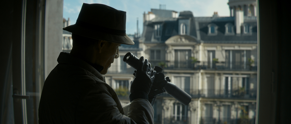
In production terms, The Killer is as complicated as Fincher movies get. Ideas are suggested, and they are constructed or deconstructed differently if they don’t work. In the opening scenes, for instance, the apartment that the killer is watching isn’t real and was constructed thousands of miles away. There was just nothing in Paris that would work for the vision the director had.
Messerschmidt explains how they found the look they were after. “We’d gone to Paris looking for a location to do it all practically. We looked for a Penthouse apartment with a vantage point across the street that could be the killer’s lair, and we didn’t find it. We didn’t because we needed windows large enough to see all of this action clearly. The decision was made to build the apartment across the street; the final scene is an assembly of three different locations. The point of view when he’s looking out of the window at the cafe and all the actions on the ground is all real, and it is a square in Paris. The exterior facades are plates shot in Paris from the same vantage point. So we did a nine-camera setup looking out of this window that captured all that action and those plates. So we had matching light and light reference,” he details.
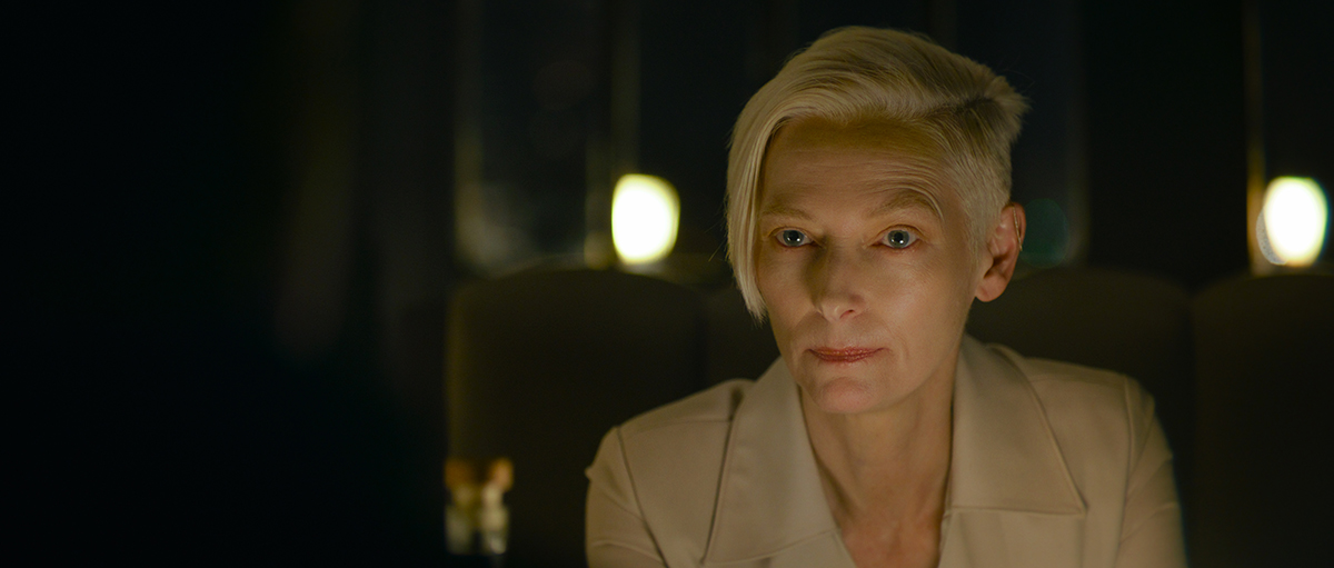
For the interior of the apartment, a set was built in New Orleans. “That’s where Michael’s action existed, and the window was real looking out to blue screen. The penthouse apartment where the target is was a build on stage as well on a different soundstage and it was a series of three-walled sets built together so the actors could walk through.”
During post-production, the set was placed on top of exterior plates that had already been shot, blending in the façade in front. “The facade was entirely digital, and the only thing that was real was beyond the windows — in fact, there was no glass either in those windows; all the glass was CG,” he says.
“We had to previsualize the action as they were all shot at separate times. The target’s movements had to be worked out because Michael’s points of view were all relevant to the edit.”
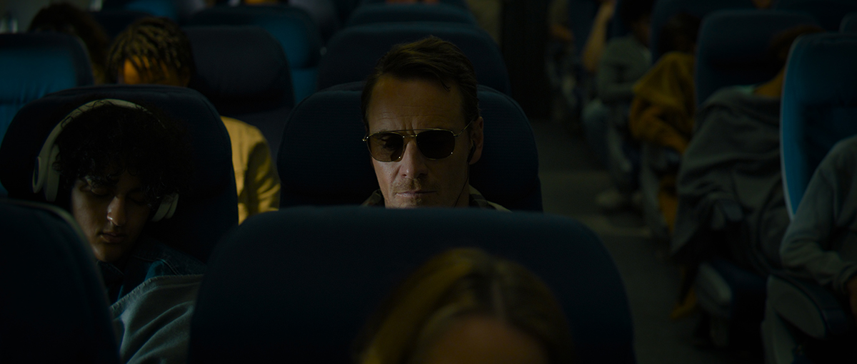
The telescopic sights were practical long lens shots, but Messerschmidt had the scope sent to post-production so they could see firsthand how the scope’s optics worked. “You then get that kind of warping around the edges, the drift of the crosshair and all the things that it really does.” This allowed the production team to capture the imagery the killer sees through the scope practically on a sound stage.
There’s no surprise that so much deconstruction is done on the movie. Fincher’s style has always been to find a way of getting the shots he wants, but this production is full of post-produced shots when doing it practically leaves too much to chance.
The lens flares employed for some of the street scenes came as a surprise to anyone who has watched Messerschmidt’s work with Fincher. He hadn’t done them before, and the flares looked different but beautiful. “Were they anamorphic flares?” we ventured to ask.
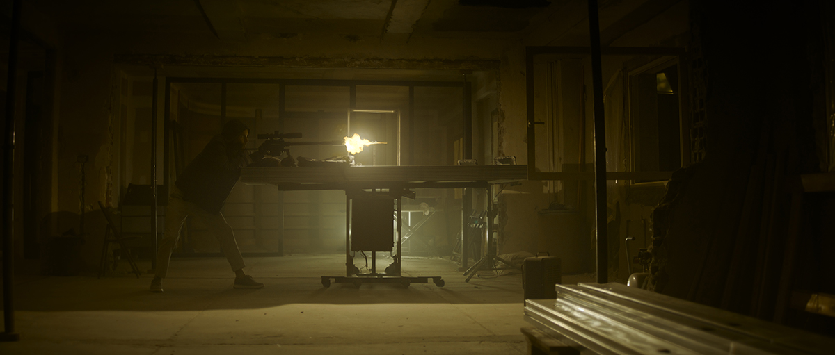
“I’m not a fan of anamorphic; in fact, I’ve never shot an anamorphic film; I’ve always shot spherical,” he replied. “I’ve shot some anamorphic commercials but have also been a bit disappointed, to be honest. It seems a little bit silly to shoot anamorphic with a digital camera. But I do sometimes like the qualities that anamorphic flares produce, but I never get them when I want them and get them when I don’t want them.”
There was some digital flare work in Mank, Messerschmidt said, “but it was very subtle. The Bell and Howell lenses of that era had particular flare characteristics that we wanted to copy. The CG artists got good at it, and I told David, ‘What if we play with that a little bit?’ So we would intentionally put bright things in the frame, practicals, or sun hits on roofs of cars where we would do an elaborate CG flare.”
Working in post-production, “I would mark it up and say that we needed a blue streak here, which should be very aggressive, and the guys would paint it in and make sure it was just right. It was an enjoyable experiment. It was cool to go in there and art direct them,” he said, adding, “I also rarely use diffusion on a lens, but there were moments in the Dominican Republic that I thought it would be interesting to try.”
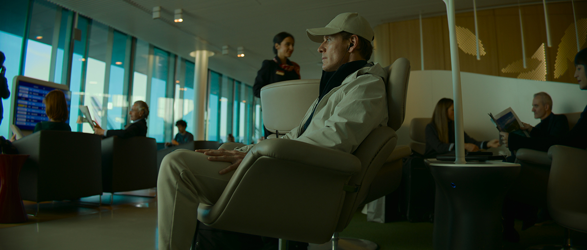
For scenes the filmmakers wanted to appear very humid, they once again went digital, using a DaVinci Resolve plugin called Scatter. “It’s a bit of post-production cinematography. I would look to do that again. I think it’s all about control; I think the fear with that decision is that if you’re working with a team you don’t trust to implement it the way you want, it is not a fear I have with David. I’m pretty involved with that process,” he explains.
“There are certain effects that you have to do optically, but I’m not nostalgic about it like some people. I don’t believe you must be incredibly dogmatic about some things; it’s about the result.”
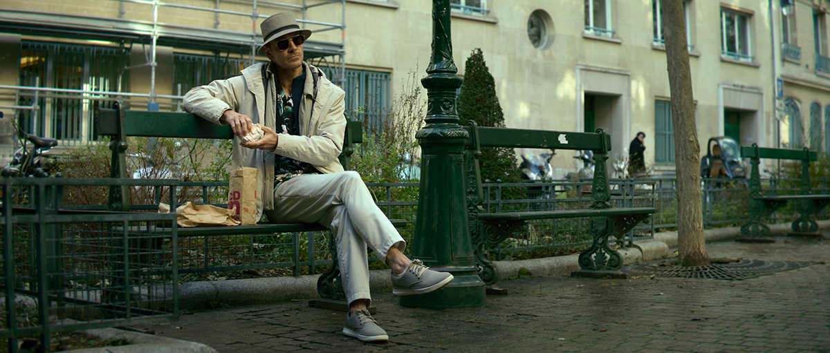
Veering back to what might be safer ground, and to more practical camera work, we inquired about the momentous fight scene towards the movie’s end, with its superb handheld camera work.
“That was quite an undertaking and a culmination of many people’s work, starting with the stunt coordinator. It was, of course, heavily choreographed and not something that was shot off the cuff. The thesis was that we wanted the audience to be geographically centered regarding understanding the space, so we didn’t deliberately disorientate them so they knew where we were in the house,” he said.
“Each room in the house has a distinct color palette that we key up in the beginning so you understand that you’re in the kitchen, gaming room, or bathroom. We go through the process of this fight, and we revisit all these spaces in reverse until he arrives back where he dropped the gun.”

However, Messerschmidt says, “there’s very little real handheld in that sequence. Almost all of that is post de-stabilization. It’s nice because we can go in there and art direct the level of shake by saying we can slow down a little bit here, quicker here. Sometimes I find that aggressive handheld is very hard to judge on the set and keep it consistent across five or six days of shooting that it took.”
For Messerschmidt and Fincher, this philosophy of only delivering the best experience for the audience is like a mantra. “It’s fun to see what we can do and get away with,” Messerschmidt concludes. “To be honest with you, anyone can shoot with a handheld shaky camera pointed at people fighting, and there’s a long history of success with that technique in action movies. There is a playbook for that. We wanted to see if we could do it differently.”

