TL;DR
- The Searchlight Pictures release and Venice Festival Golden Lion winner “Poor Things” is an awards season favorite on multiple counts, not least the cinematography of Robbie Ryan.
- Ryan explains his use of various wide angle and vintage lenses used to shoot within large scale “composite” sets using virtual production techniques.
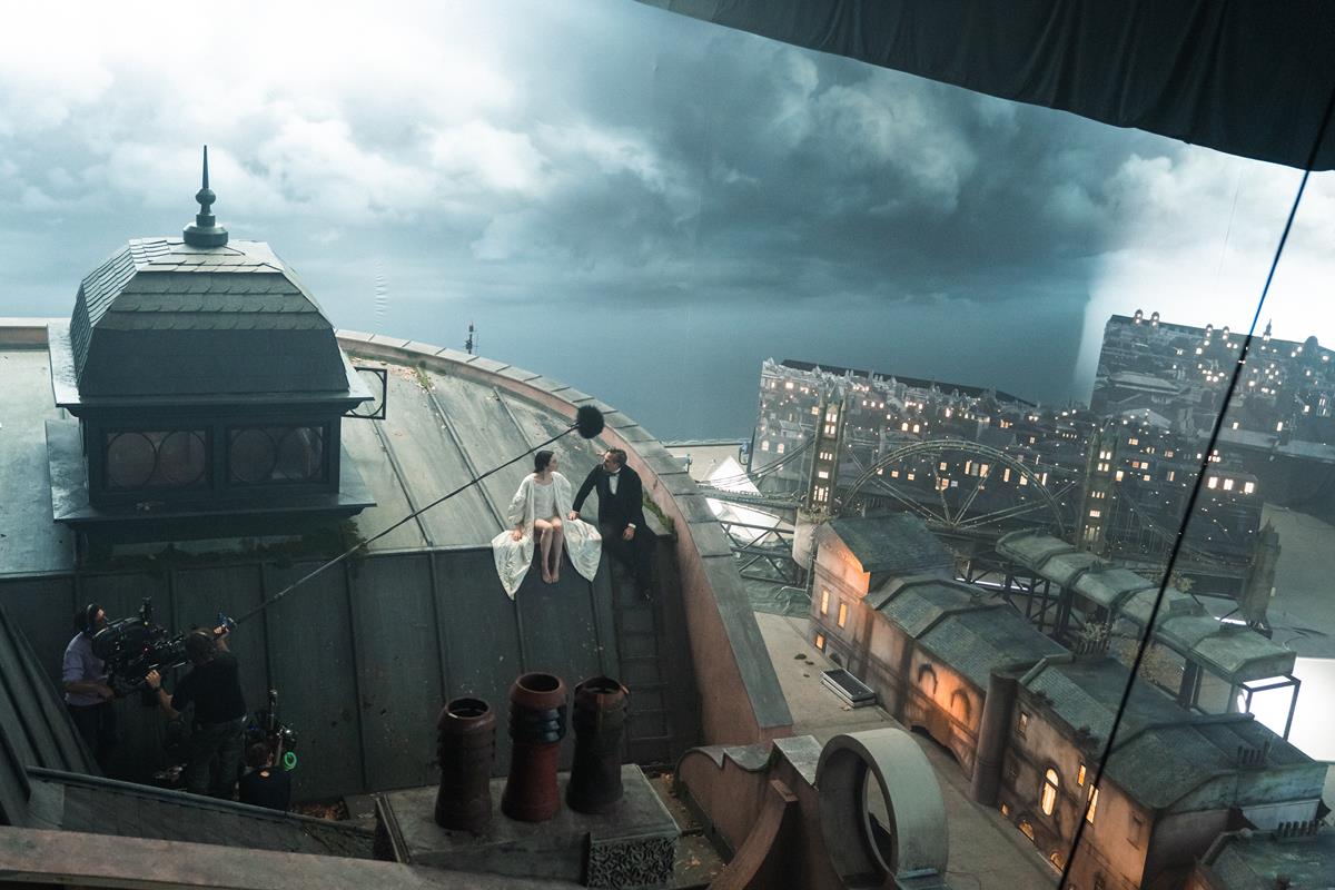
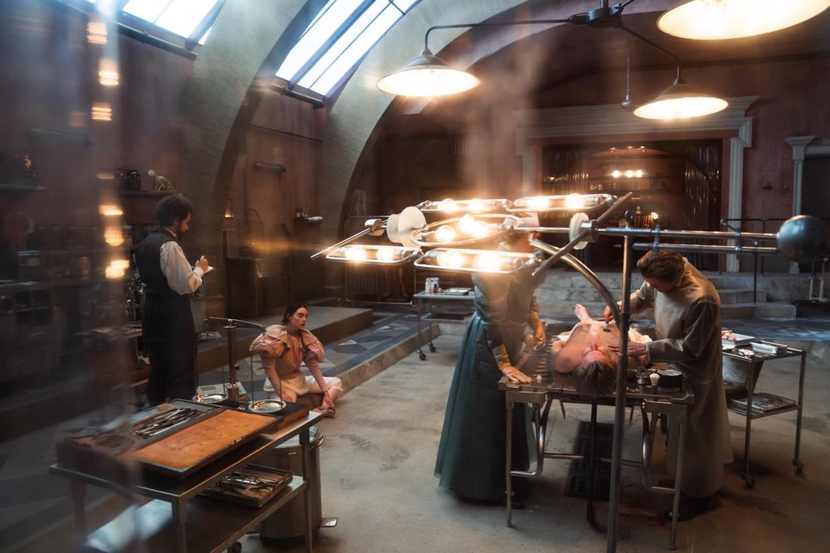
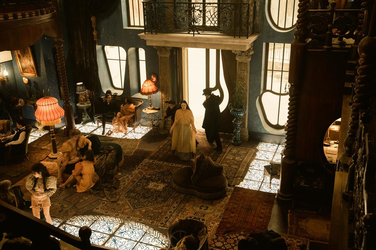
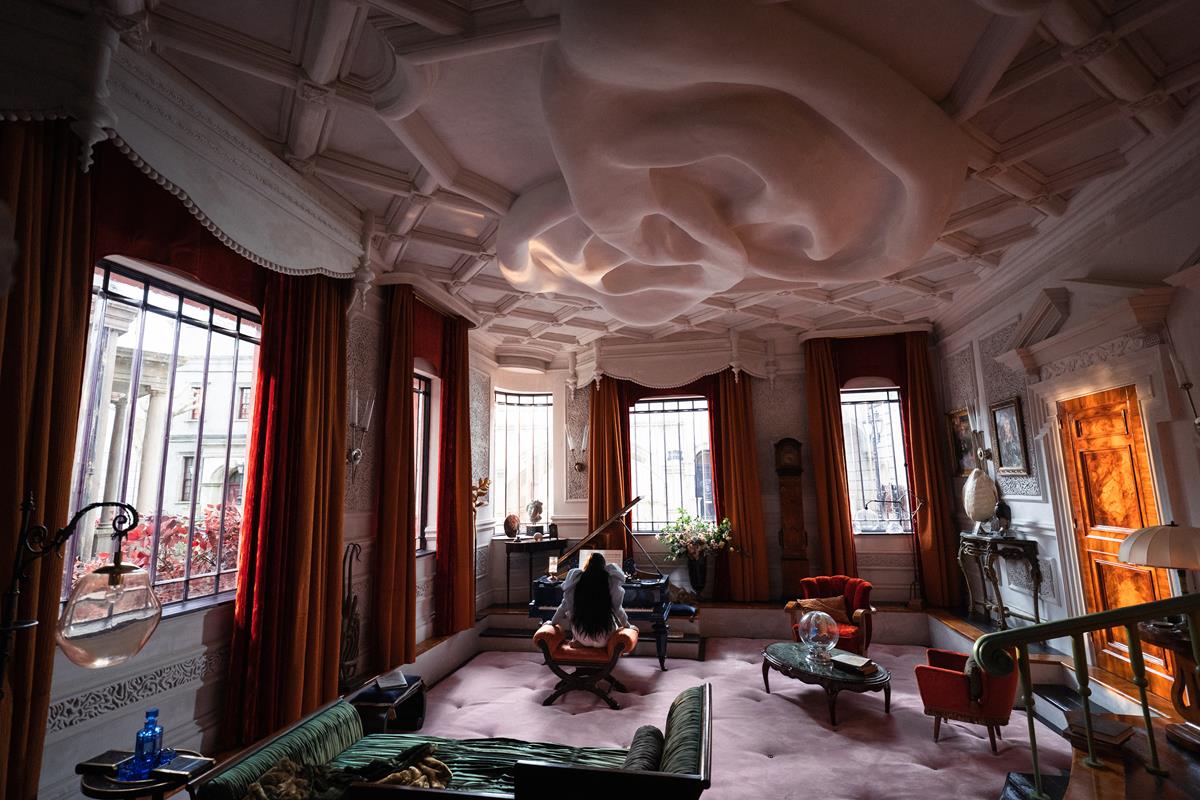
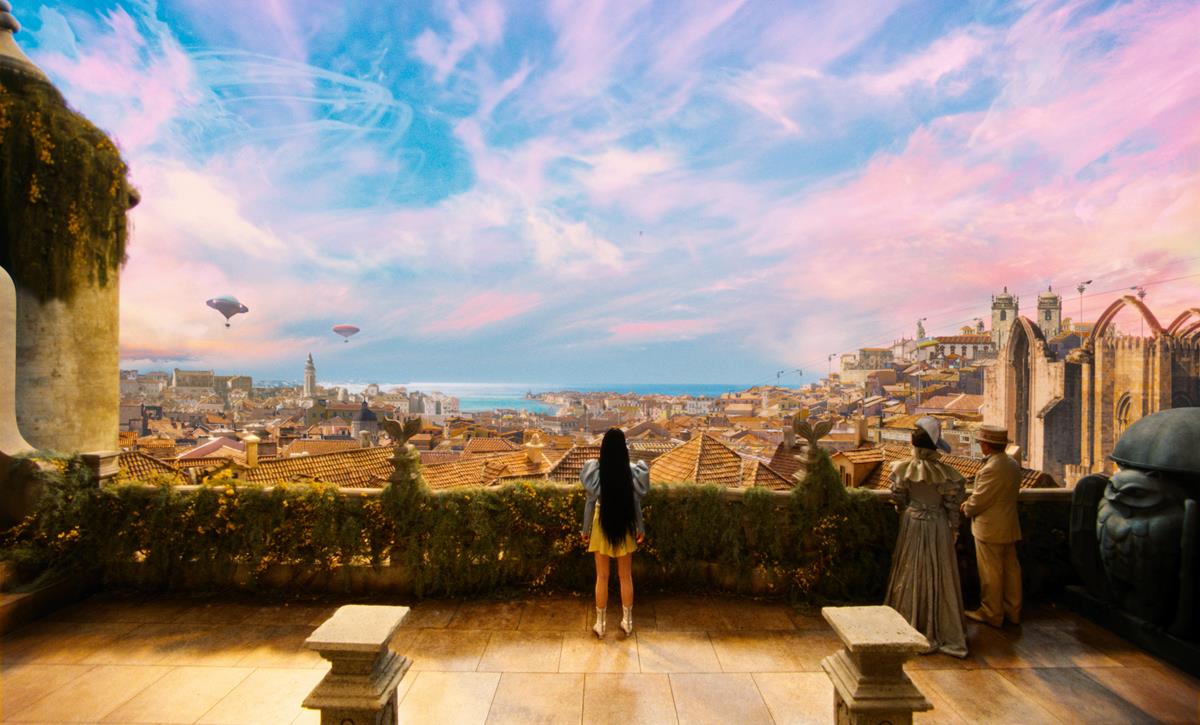
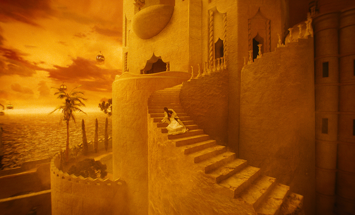
- Production designer James Price built four large composite sets at Origo Studios in Hungary, which deployed painted backdrops and cutouts as well as LED walls.
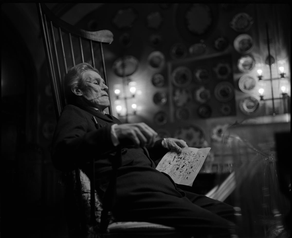
- Portions of the film are also shot in black and white, with the final decision to do so only agreed upon at the last minute.
- Director Yorgos Lanthimos says references for the creative team included “Dracula” and the films of Fellini and Fassbinder, as well as Powell and Pressburger — all famed for their surrealist and extreme screen visuals.
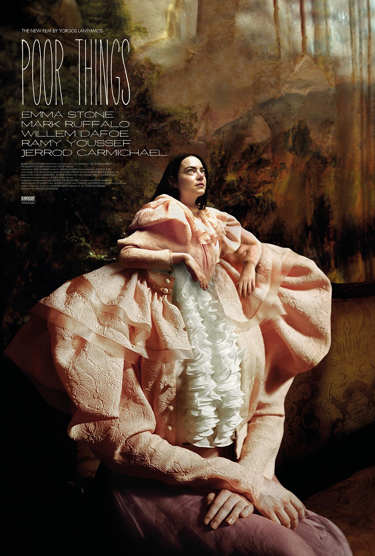
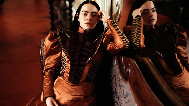
In what critics are hailing as his boldest vision yet, auteur Yorgos Lanthimos (The Lobster, The Favourite) delivers Poor Things, a punkish Frankenstein update that metamorphoses into a feminist fairy tale.
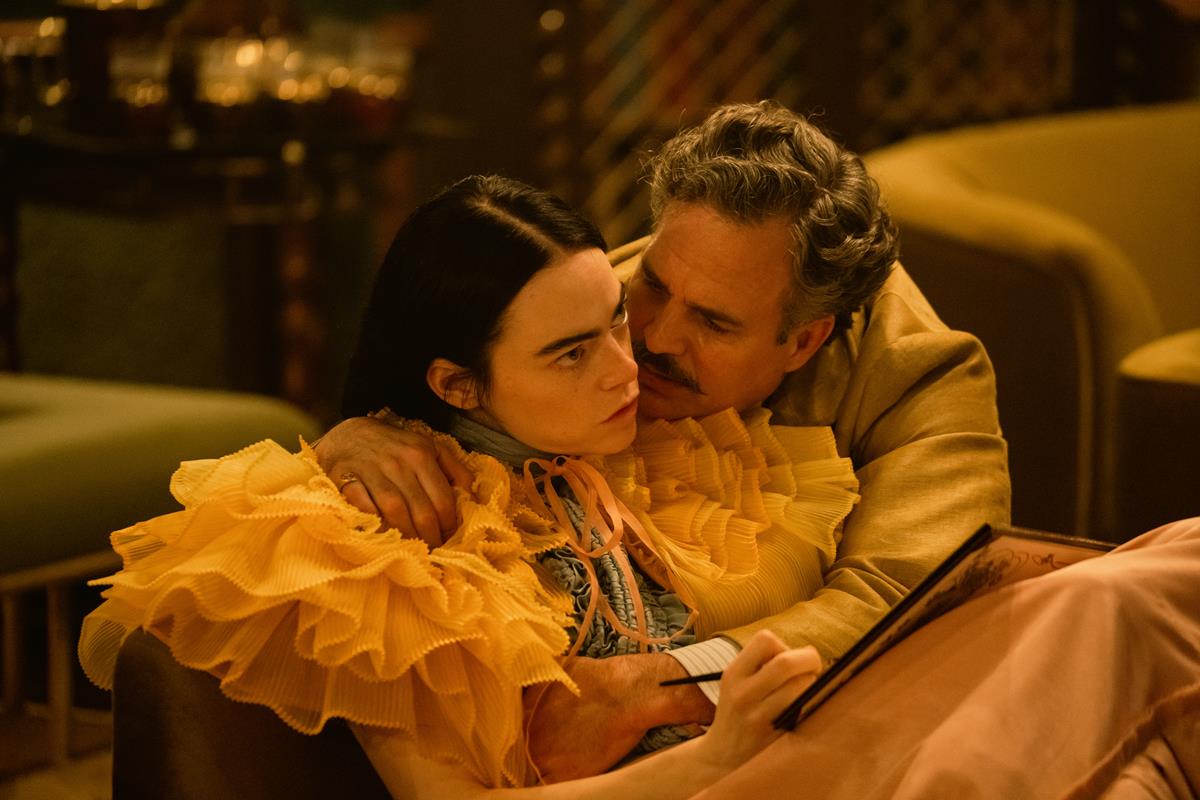
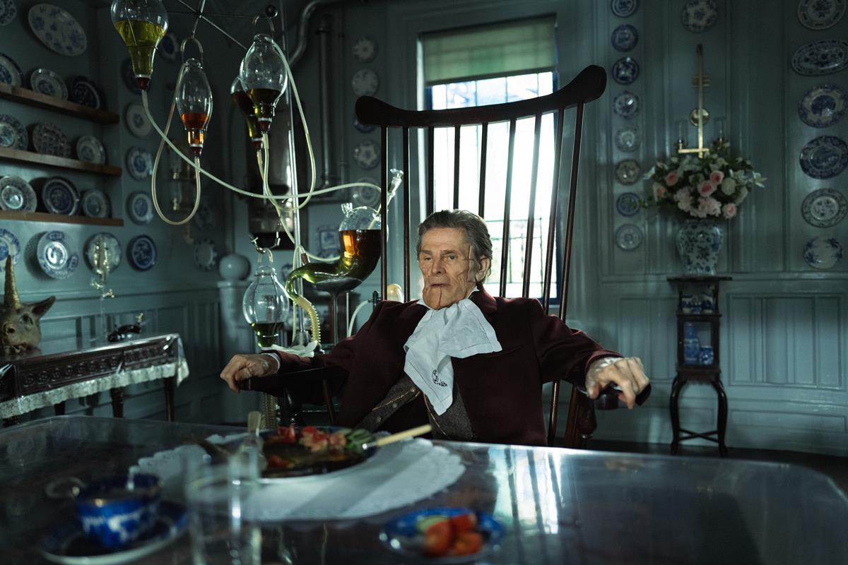
In the Searchlight Pictures release and Venice Festival Golden Lion winner, Emma Stone plays a peculiar, childlike woman named Bella who lives with a mysterious scientist and surgeon (played by Willem Dafoe). The movie is set in an alternate version the 19th century and based on the 1992 novel by Alasdair Gray.
“I read the book around 2009 and immediately fell in love with it,” the director explained during a Q&A session following a screening at NYFF. “I hadn’t read anything like it. And it was mainly the character of Bella Baxter that I was drawn to.
“I just thought she was just this incredible, unique human being. The world of the novel itself, all the characters and the premise of it allowed you to explore the story of this woman who has a second chance in life to experience the world in her own terms.”
Lanthimos says that other references for the whole creative team included Dracula and the films of Fellini and Fassbinder, as well as Powell and Pressburger — all famed for their surrealist and extreme screen visuals.
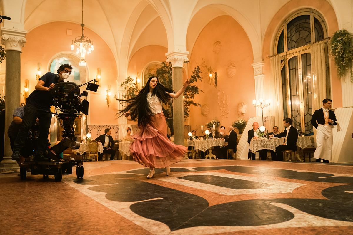
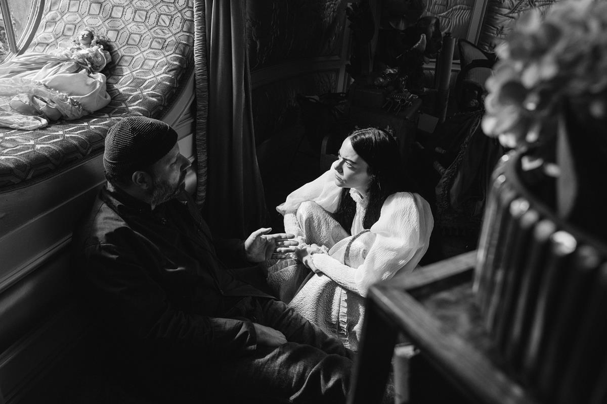
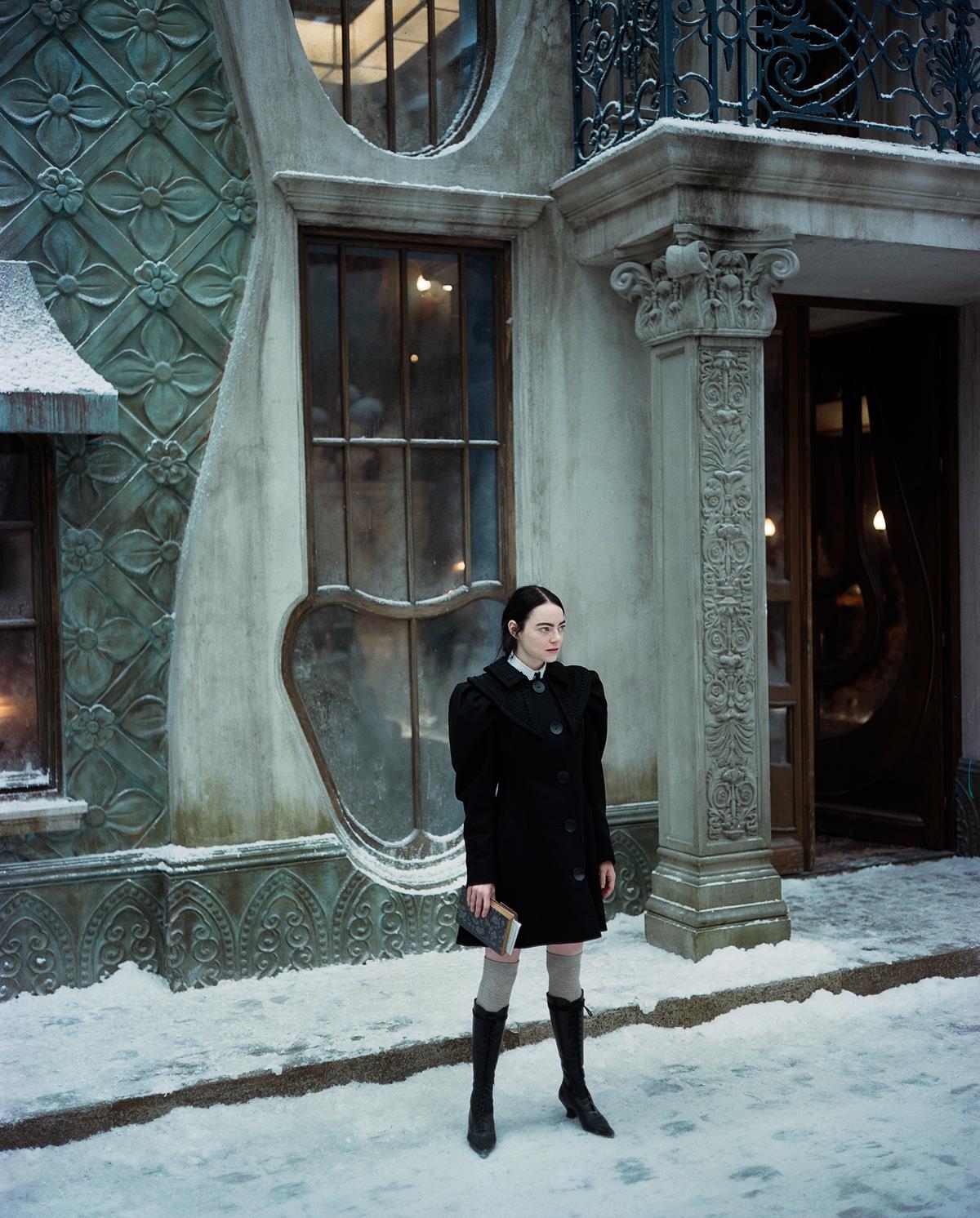
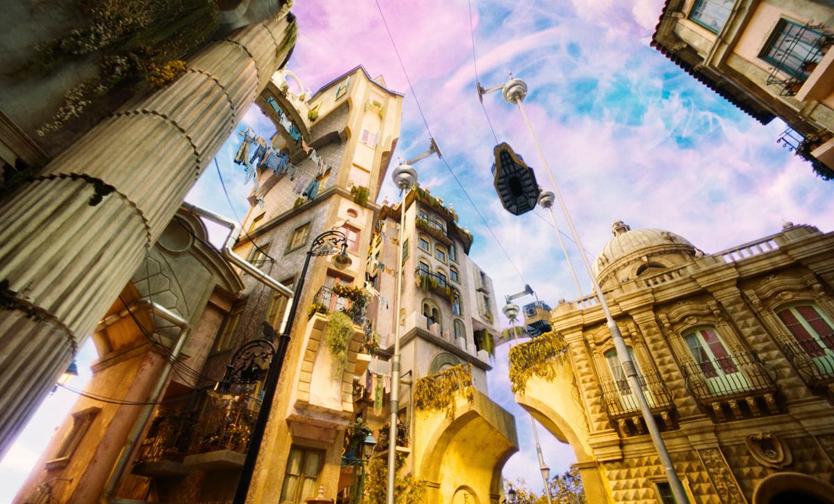
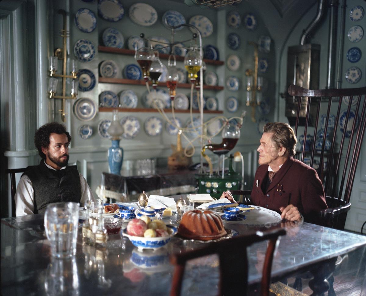
In the same on-stage discussion, production designer James Price explained how he built four large composite sets at Origo Studios in Hungary, “which become something more like an immersive set, a like a Disney theme park,” he said. “Nobody builds set this big anymore.”
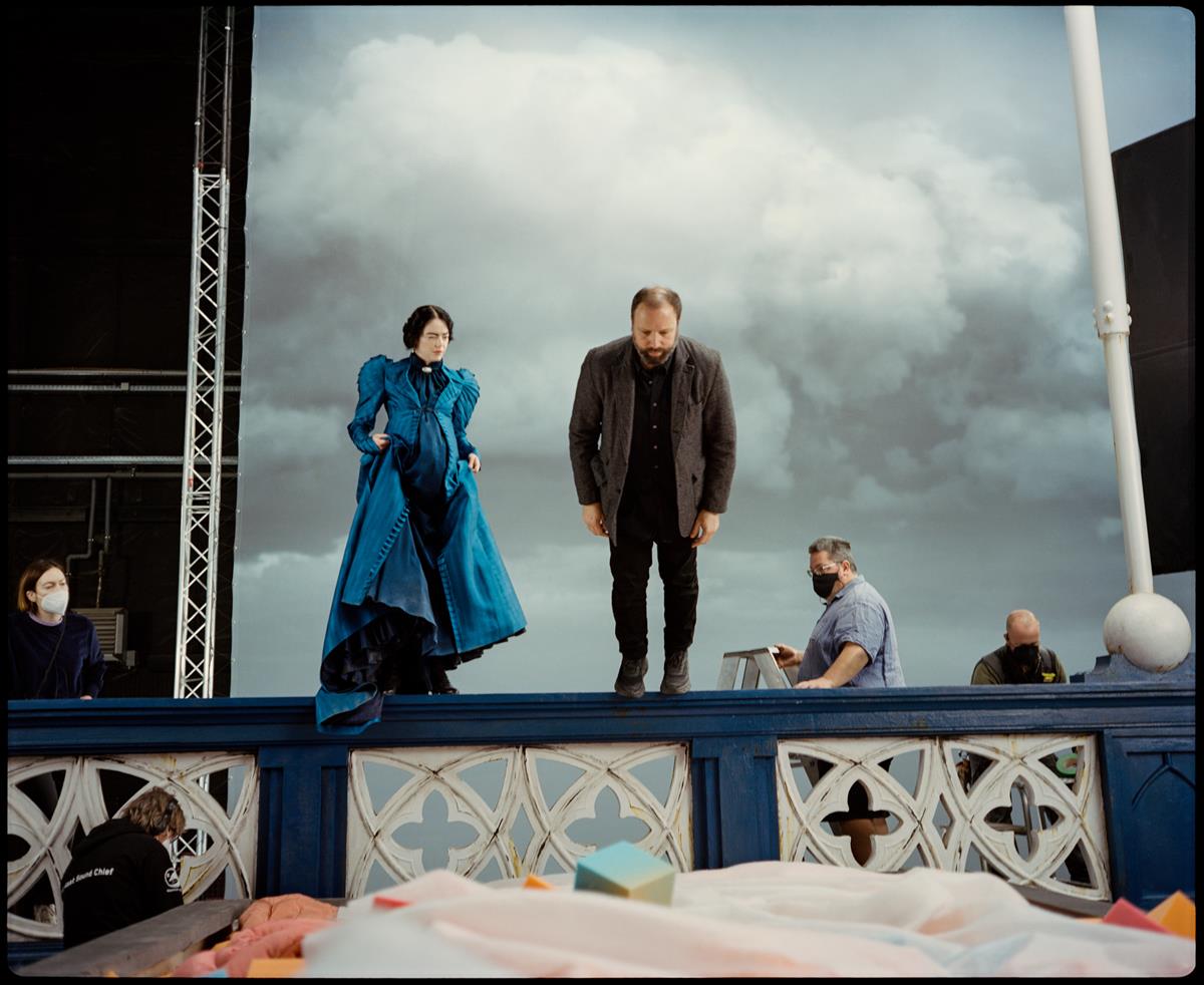
They didn’t use vast canvases of green screen. Instead they deployed painted backdrops and cutouts “techniques that nobody ever does anymore,” Price said.
Costume designer Holly Waddington, also on the panel, said she drew inspiration for fabric color from anatomical drawings and bodily fluids, “the yucky ones and the beautiful ones and everything in between… pinks and saturated reds and lilac sort of tripe colors. I always tried to relate it to something a bit revolting.”
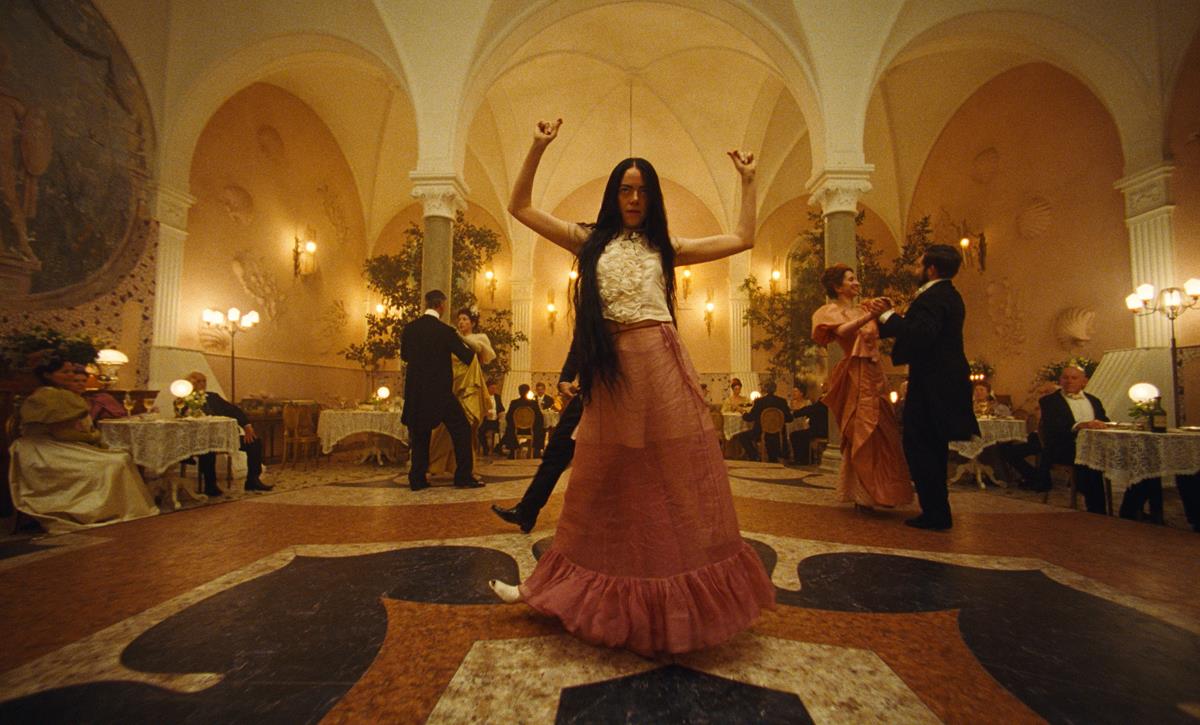
For The New York Times series “Anatomy of a Scene,” Lanthimos dissects a sequence that takes place in a restaurant in Lisbon, and explains how Emma Stone with choreographer Constanza Macras devised her deliberately awkward dance moves.
Arguably, the real star on the technical side is Irish cinematographer Robbie Ryan, ISC, BSC, working on his second film with Lanthimos after being nominated for an Oscar for The Favorite.
Describing the director himself as “an astral cinematographer,” Ryan says that the desire was always to shoot on 35mm.
“That sensibility is something that kind of lands with the rest of the film where you’ve kind of got a whole sort of universe that is unique,” he says in an interview with Denton Davidson for GoldDerby. “Yorgos wanted to create a world for Bella to be in that nobody else would see. [We see it] only through her eyes.”
The DP’s work started with three months of prep to try out new film stocks and various lenses. “We did one test where we had about 50 lenses that we had to look through, and we had to get through that in one day,” Ryan told John Boone at A.frame. “It was a process of evolving and discovering as far as sorting the language for what we were going to do.”
Shots with an extreme wide angle 8mm fisheye lens were used to explore Baxter’s lab, and are of a type that he employed on The Favorite. This time the wide angles give the impression of almost looking through a peephole or a magnifying glass.
“This is extension of the wide angle language that Yorgos has been of developing over other films,” he told Davidson. “We wanted [to recall] the old vintage photography, where you would see a lot of vignette sort of kind of effects, because the big plate cameras that would have been used in early photography had la lens that didn’t cover the full width of the glass plate that would have been used for the camera.”
The extreme wide angle lenses paired with a 35mm camera allows the viewer to feel like “you can almost step into the world,” he says.
Vintage Petzval lenses, originally ground in 1910 for projectors, were also deployed for period effect.
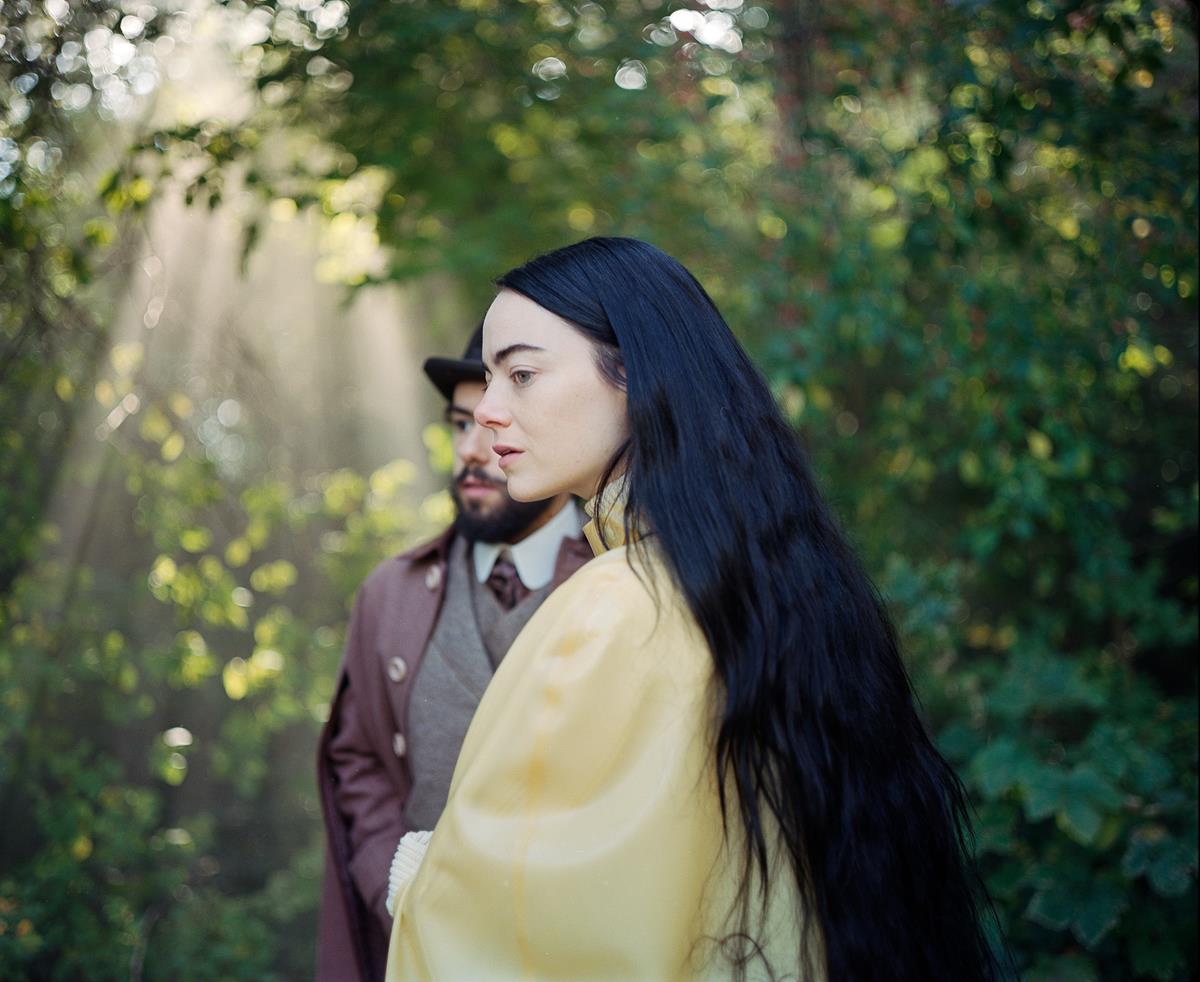
“They’ve been rehoused which made them possible to shoot portraits as a camera lens,” he told Screen Rant’s Caitlin Tyrrell. “They had this beautiful way of creating a soft fall, a shallow focus and a kind of a crazy bokeh. But they evoked a lot of early photography. It makes me feel that we are connected a bit to the old world of photography, almost painterly. I remember the production design team mentioning Hieronymus Bosch quite a bit in prep.”
READ MORE: Poor Things Interview: DP Robbie Ryan On Emma Stone Departing From Her Usual Roles (Screen Rant)
VistaVision lenses from another antiquated filming technology were adapted for use in a specially constructed “Frankenstein camera,” Ryan told an audience at Camerimage, as Variety’s Will Tizard reports. This achieved the desired period look but was tricky to work with, he said.
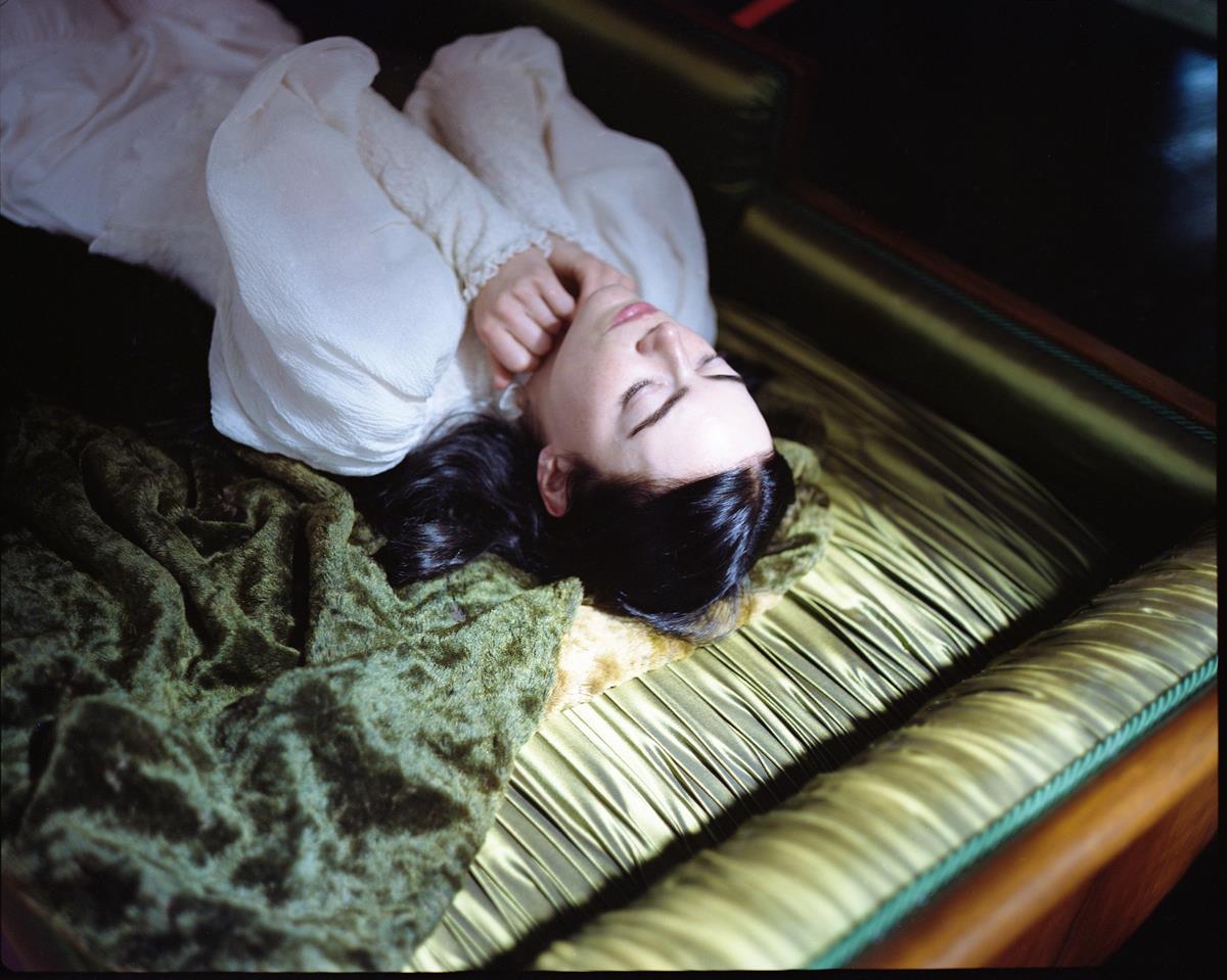
He also said that the results at times bordered on “mystical,” citing an incident when the camera’s “crap batteries” began to run down as he was filming Bella awakening from the dead. The film’s slower transport speed resulted in a slightly sped-up Stone sparking to life in a way no one had quite anticipated.
With Lanthimos adamant that he wouldn’t do additional dialogue replacement in post-production, it also meant the VistaVision camera could only be used for scenes where capturing dialogue on set wasn’t an issue.
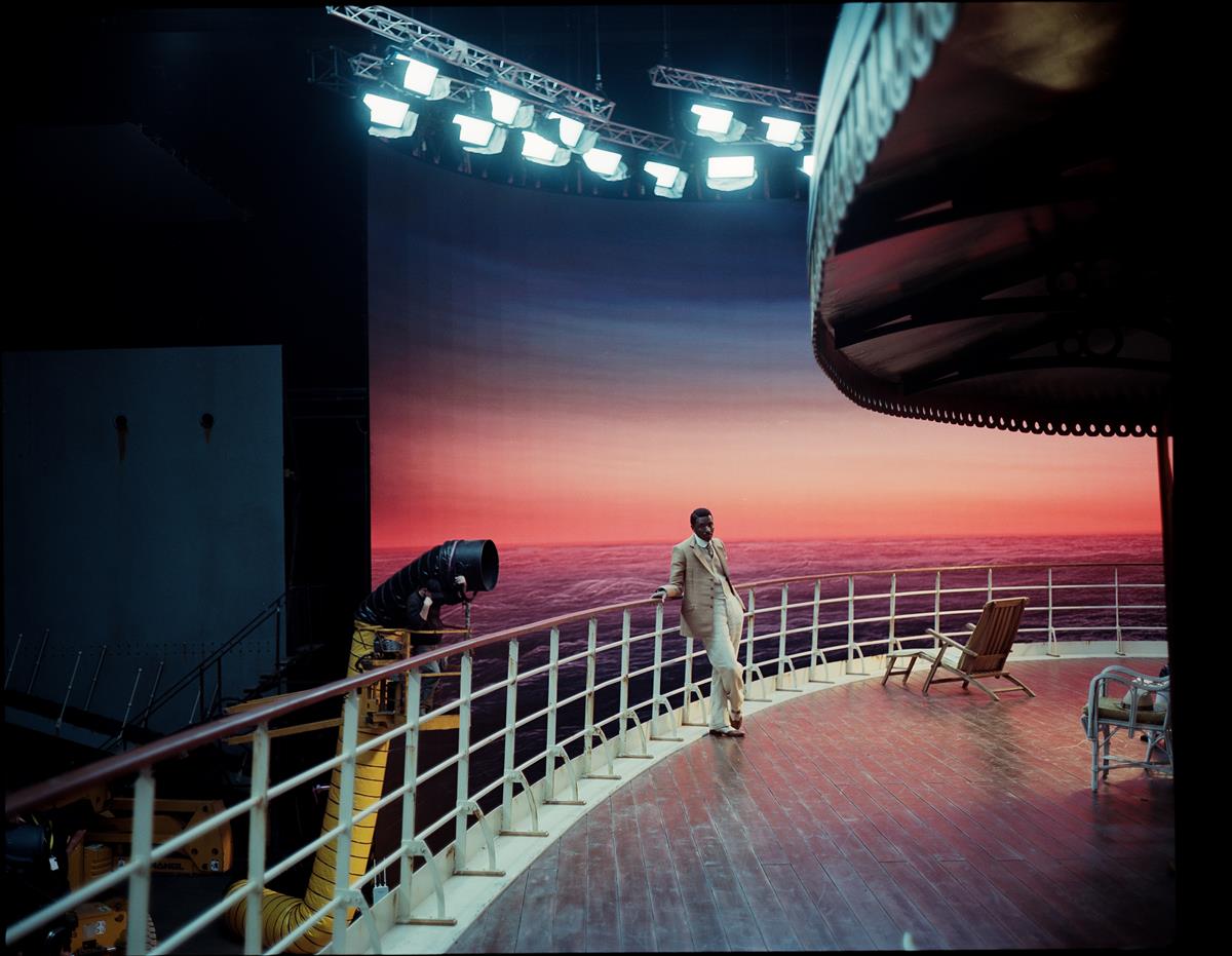
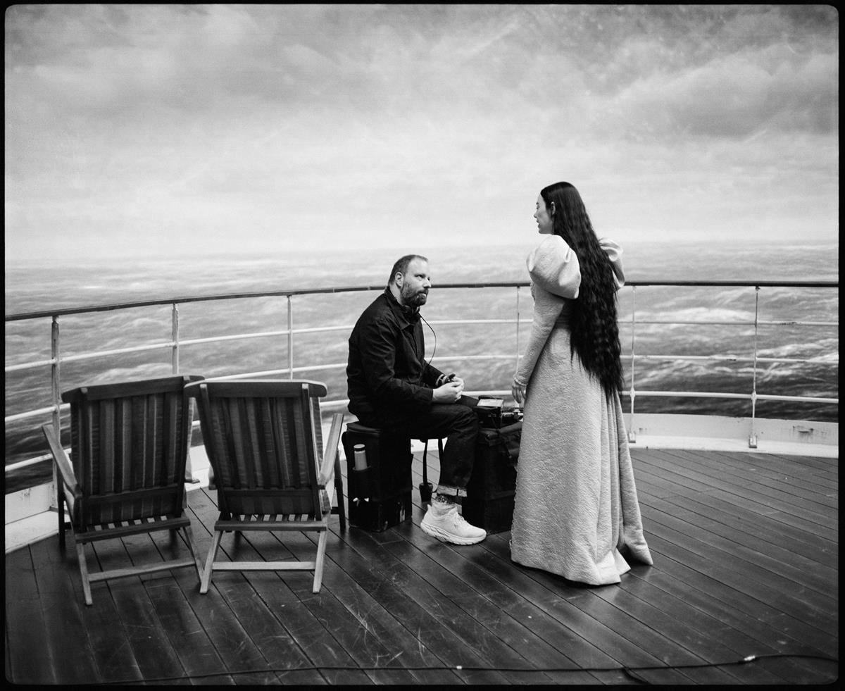
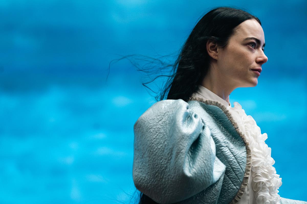
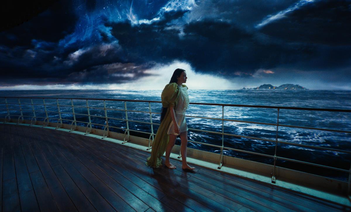
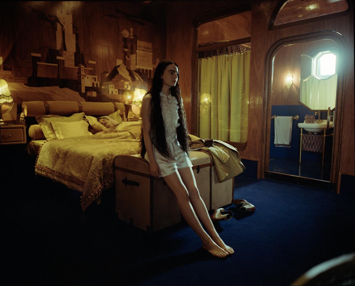
Augmenting these old-school techniques and kit was the use of a virtual production screen to help create the views from the cruise ship.
Ryan called the 70-meters-long by 20-meters-high wall a “moving painted backdrop” in an interview with James Mottram for British Cinematographer. “For the cruise ship, Yorgos was always very keen to try out an LED backdrop, because then we could have the waves moving and the clouds moving,” he said.
Even though the set was small enough relative to the wall, shooting on wide angle meant they had to mask the ceiling. There were also issues with needing to illuminate the foreground set with a lot of light because he was shooting on negative film.
“That spillage of light is really painful, because it makes the LED wall lose its punch,” he revealed. “So, you’re kind of having to balance out so much all the time… it was a technical head wreck to try to keep the light on the deck, but not on the screen. And the fact that the deck of the ship was only probably four meters away from the LED wall made it really very difficult to stop this light spill, which made my life hell!”
READ MORE: Robbie Ryan BSC ISC / Poor Things (British Cinematographer)
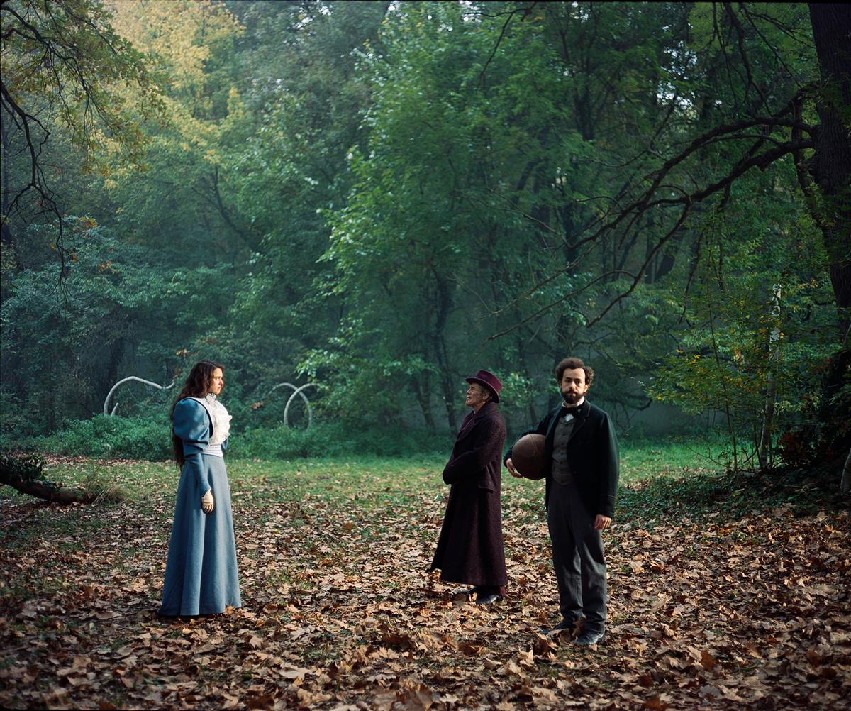
Even the film stock itself was pushed to the extreme. Portions of Poor Things are shot on black and white, while Lanthimos was keen to shoot other sequences using Ektachrome. Because he wanted Ektachrome in 35mm, Kodak had to manufacture it specifically for the film.
“They only ever made it a 16mm Ektachrome, so Kodak cut it to 35mm and we processed it as reversal for reversal,” he explained to A.frame. “That’s something that’s never been done before. It’s actually a lot more versatile a stock than I thought it would be, but when we were filming with it, we were under the impression that if you were to underexpose, it would be irretrievable. So, I was [thinking], ‘Oh my God, if this stock comes back underexposed we’re in trouble.’ So you had to get it right. But the results were beautiful.”
Another challenge for Ryan was learning to shoot a lot of the picture on zoom lenses. Since he also operates the camera he had to perfect zoom control, as he explained to A.frame.
“For me, the wide angles are not difficult. I just put the wide angle on and everybody else — production design and sound — has a nightmare. The challenge for me, camera-wise, was the zoom, because I didn’t want to mess up any of the acting. I got the hang of it, but it was still nerve-racking and it pushed me to my limits.”
READ MORE: ‘You Have to Go Beyond Your Limitations’: Breaking Down the Craft of ‘Poor Things’ (A.frame)
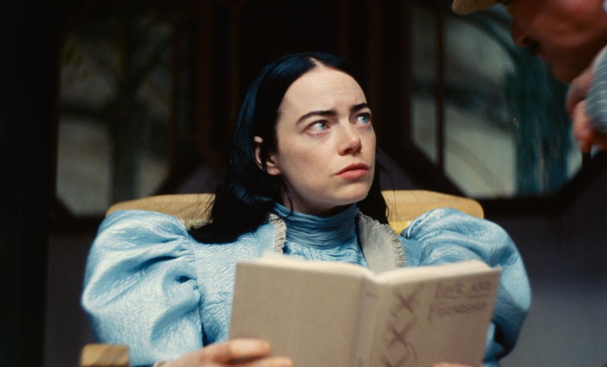
The studio-bound film was also unusual for a DP who typically shoots on location. This presented particular challenges around the lighting.
“The great thing was it kind of still felt like we were on a location because they just built the locations in this amazing detail,” he told Denton. “So everything in front of the camera is there. It was the same approach I would do normally, just I had to do a lot more lights and we had to build skies for cities like Paris and Lisbon.”
The wide-angle scope was so extreme that the fantastically detailed Victorian-style sets had to be created to all but completely wrap around the camera — which also made hiding lights and sound gear a challenge.
“They created all these composite sets, where you can walk in the front door and every little thing is shootable,” Variety reports he said at Camerimage. What’s more, Ryan added, is that sets don’t fly away to make space for the camera as it passes — instead, it must move through real rooms, halls and up and down stairs.
READ MORE: Robbie Ryan (‘Poor Things’ cinematographer) on working with Yorgos Lanthimos: ‘You don’t know what’s coming next’ (GoldDerby)
Choosing to shoot half an hour of the film in black and white and on B&W film stock, rather than shooting color and converting to B&W in post, was another key creative decision.
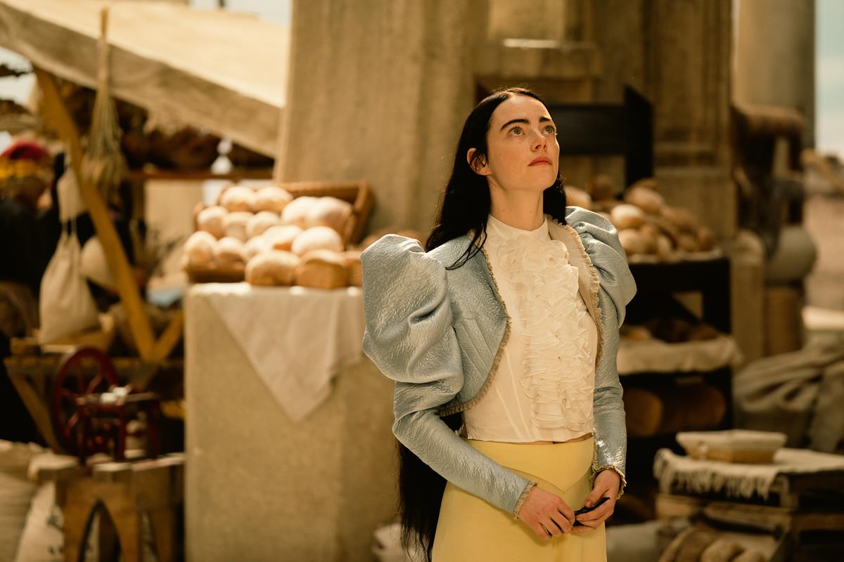
Davidson gets Ryan to talk about this in relation to the opening shot of Emma Stone dressed in an elegant blue outfit which then cuts to the black and white footage.
The reasoning, says Ryan, “and I’m probably gonna get in trouble for saying it,” is that if audiences saw a black-and-white image at the beginning of the film they might think the entire film was going to be black and white, and might tune out.
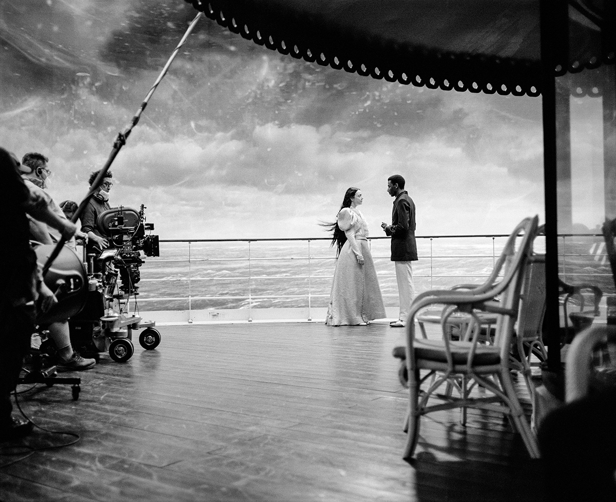
“I think we put a color shot out of the start so everybody will think it’s a color film, and then it goes to black or white, [then] goes into color again. That was sort of the theory behind that,” he continued.
“What I love about the use of color and black and white in the film, is that usually when you see a film, flashbacks are in black and white. But in this film, the film is in black and white and the flashbacks are in color.”
READ MORE: Cinematographer Robbie Ryan: Director Yorgos Lanthimos Worked Crafts Magic on ‘Poor Things’ (Variety)
Ryan revealed to Movieweb that the decision to shoot black and white came just nine days before principal photography. “Yorgos said he had to go ring the producers at Searchlight, and it was like touch and go whether they would let him do it.”
Next, Watch This:

