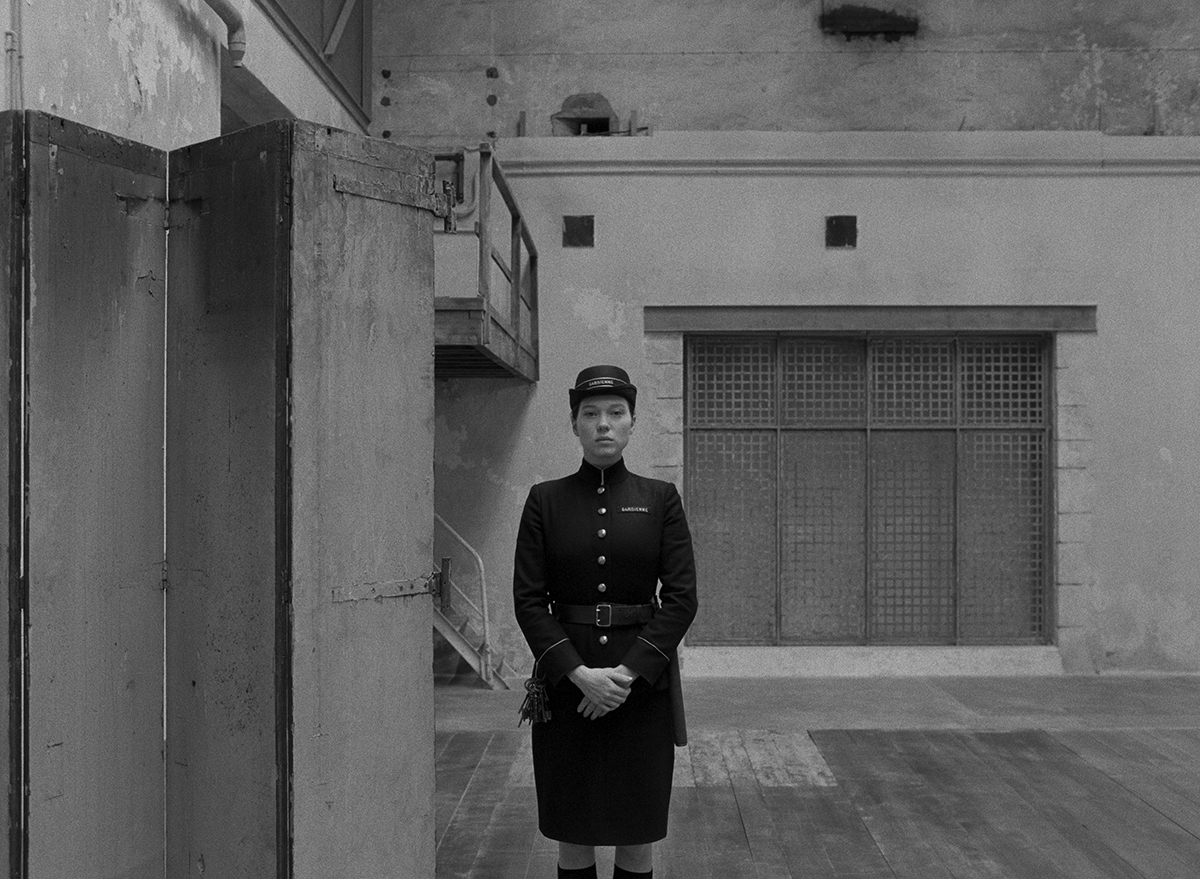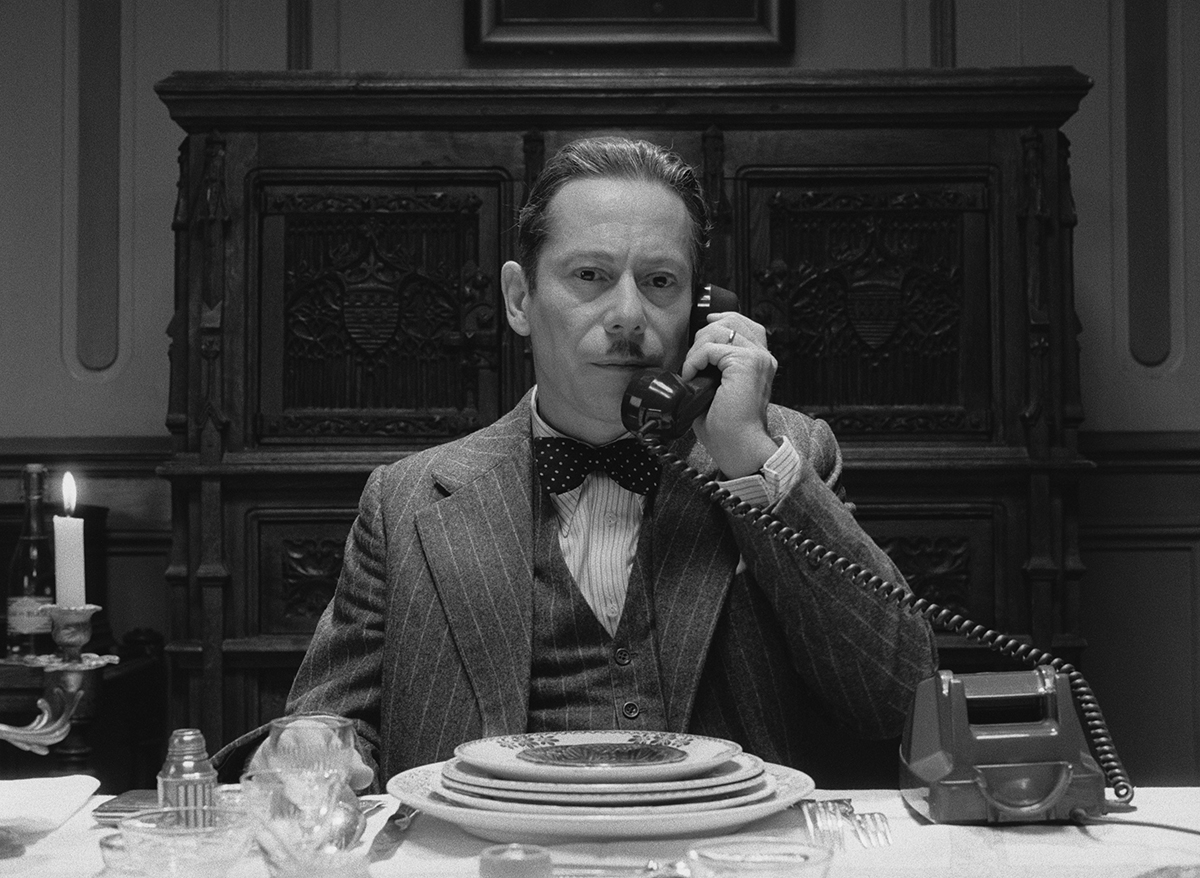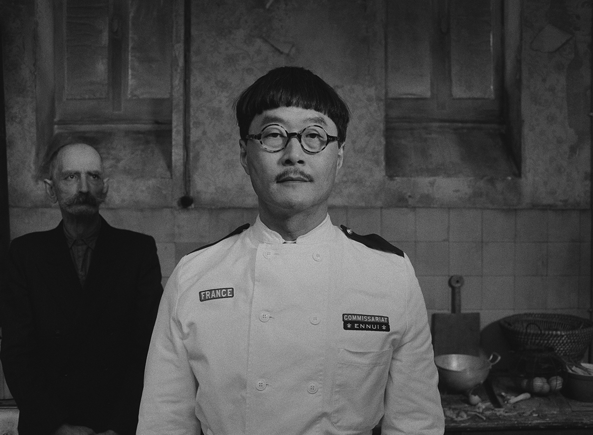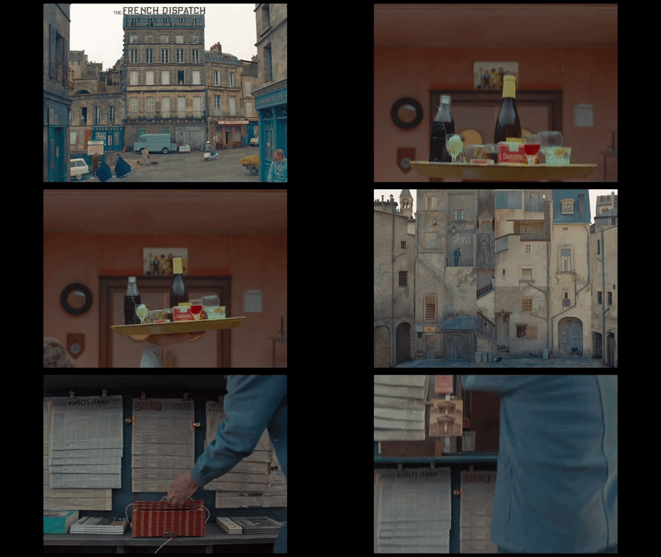
The French Dispatch is not for everyone.
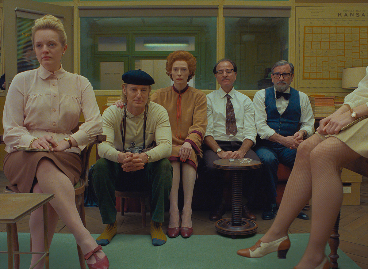
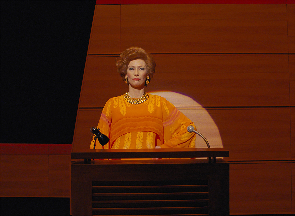
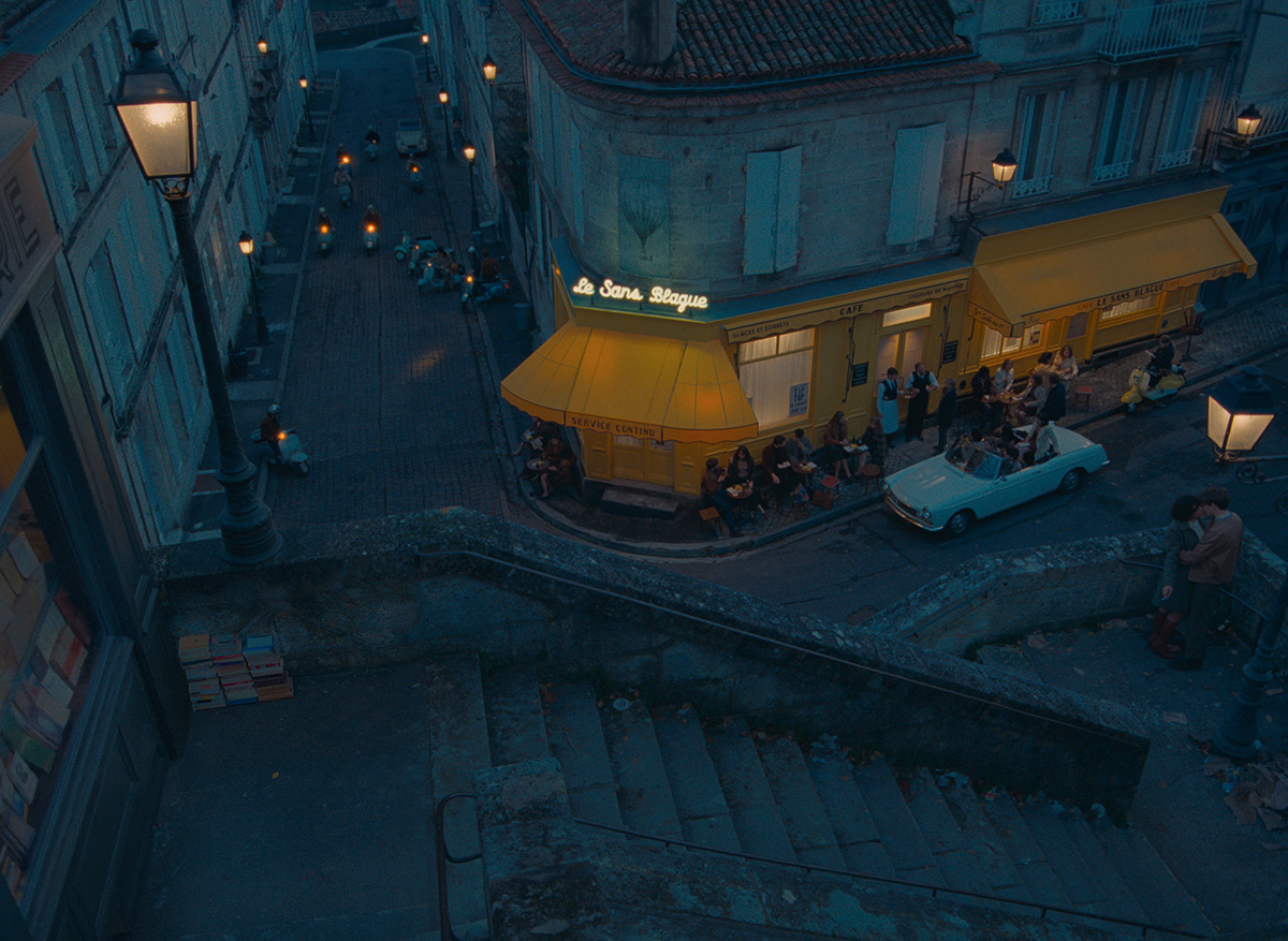
The anthology film is bursting with Anderson’s signature idiosyncrasies, but its experimental format and remarkably specific references render it rather “recondite” (my husband’s conclusion after viewing it). But for some of us, therein lies The French Dispatch’s charm.
The latest edition in the Anderson canon is targeted at bookworms — but not just any readers. To truly appreciate the attention to detail and exceptionally researched composite characters, one should be a fan of the early New Yorker expat literati. (For those not already immersed in this culture, Anderson provided a most useful reading list.)
However, film buffs are also likely to appreciate the almost intimate glimpse into Anderson’s own tastes, life, and friendships that a close watch unveils. It’s quite easy to imagine this picture making its way into film school syllabi. Those enamored with the traditions of French cinema will also be empowered to appreciate many of Anderson’s choices.
In a compellingly meta turn of events, Anderson sat down for three New Yorker interviews (one of which was produced for The New Yorker Radio Hour, listen below) to promote the project.
Anderson explained to The New Yorker’s articles editor Susan Morrison that the movie was borne out of three very different ideas.
His foundation was the “omnibus” or anthology concept. He next mixed in a longstanding ambition to bring to life a fictionalized version of The New Yorker magazine, and, finally, incorporated his desire to make a movie set in France.
From these “three very broad notions” Anderson tells Morrison, “I think it sort of turned into a movie about what my friend and co-writer Hugo Guinness calls reverse emigration.”
Anderson is himself a part-time expat, with an apartment in the same Parisian arrondissement as once occupied by the late Lillian Ross.
“In Paris, any time I walk down a street I don’t know well, it’s like going to the movies.”
— Wes Anderson
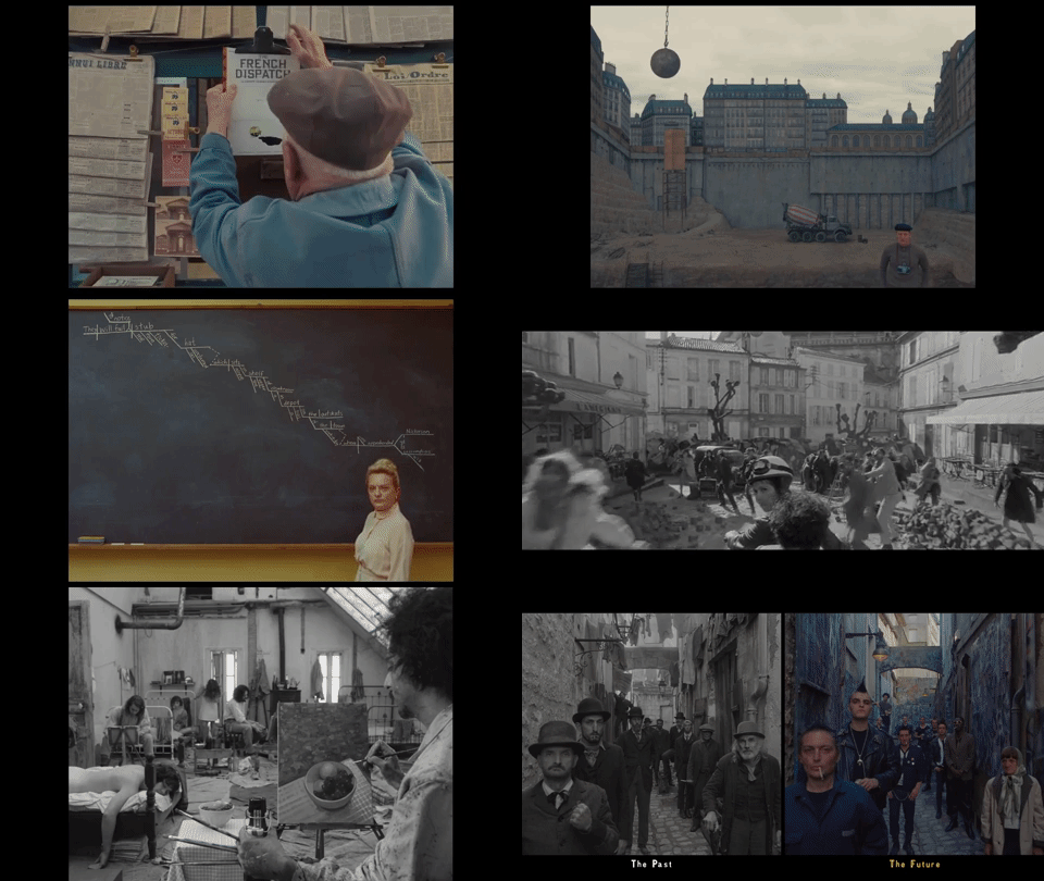
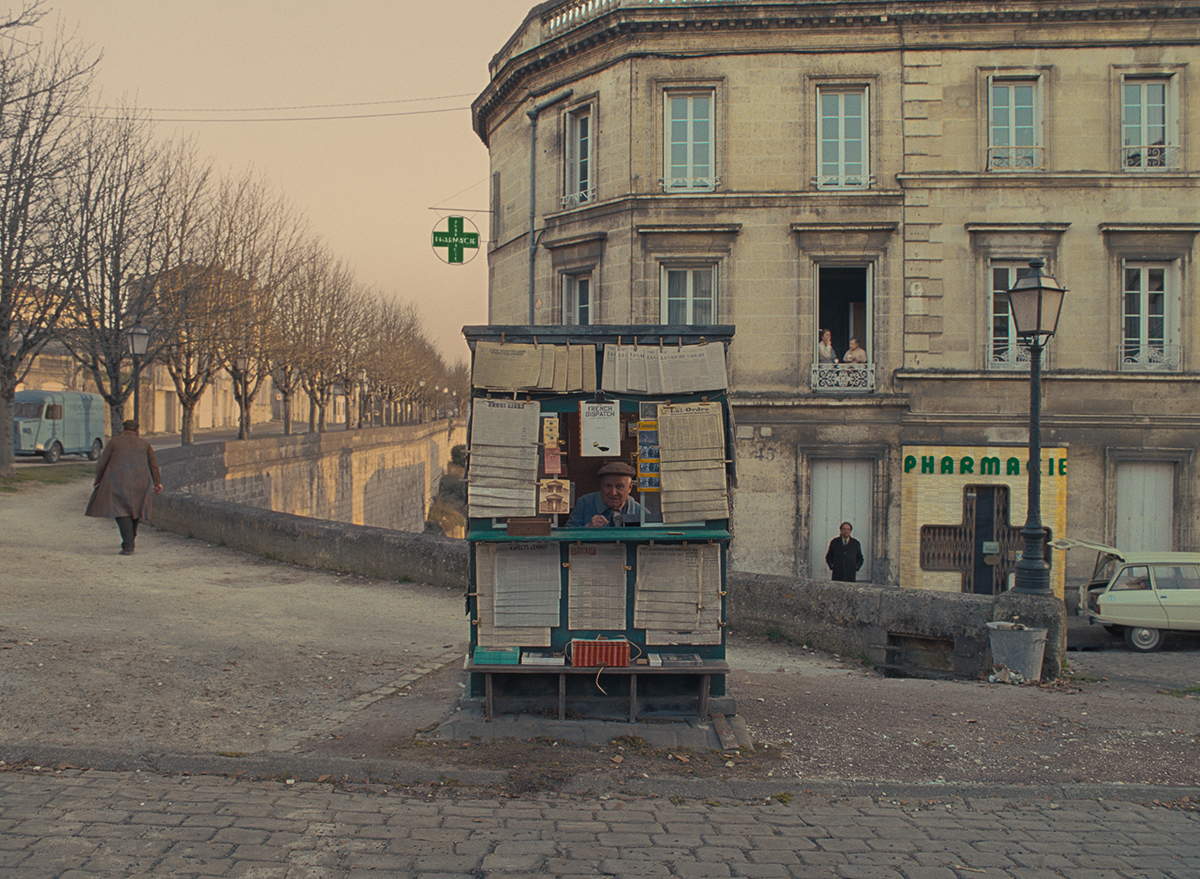
“In Paris, anytime I walk down a street I don’t know well, it’s like going to the movies. It’s just entertaining,” Anderson says. “There’s also a sort of isolation living abroad, which can be good, or it can be bad. It can be lonely, certainly. But you’re also always on a kind of adventure, which can be inspiring.”
In addition to the setting, Anderson says the team “wanted the movie to be full of all of the things we’ve loved in French movies” and did so in a manner that encourages viewers to delve into the world of French cinema. “We were stealing things very openly, so you really can kind of pinpoint something and find out exactly where it came from.”
Your Pre- Or Post-Watch Reading List
Morrison’s interview of Anderson was also used as the forward for The French Dispatch’s companion essay collection, “An Editor’s Burial.”
He tells Morrison, “Our movie draws on the work and lives of specific writers. Even though it’s not an adaptation, the inspirations are specific and crucial to it. So I wanted a way to say, ‘Here’s where it comes from.’ I want to announce what it is. This book is almost a great big footnote.”
But that’s not the only reason Anderson undertook this endeavor. It was also a passion project. “[It’s] an excuse to do a book that I thought would be really entertaining. These are writers I love and pieces I love.”
READ MORE: How Wes Anderson Turned The New Yorker Into “The French Dispatch” (The New Yorker)
Cinema-inspired playlists are a common feature in the Spotify era, but for this movie, a recommended reading list feels more apt. However, Anderson went one step further (as he usually does!) and published an anthology featuring the writing that inspired the movie.
Publisher Pushkin Press describes the volume as a “glimpse of post-war France through the eyes and words of 14 (mostly) expatriate journalists including Mavis Gallant, James Baldwin, A.J. Liebling, S.N. Behrman, Luc Sante, Joseph Mitchell, and Lillian Ross; plus, portraits of their editors William Shawn and New Yorker founder Harold Ross.”
Catherine Rickman of Frenchly argues that the tome is a roadmap to having the fullest experience of the movie. She writes, “For anyone hoping to truly appreciate The French Dispatch, ‘An Editor’s Burial’ should be required reading.”
Rickman says that the book stands out because the “collection is more than just a highlight reel of some of the best journalism in recent memory, or something to scratch a Francophile’s itch for nerdy nostalgia. Instead, it is yet another of Wes Anderson’s impeccably curated confections, designed to make you laugh, cry, and smile wryly while the whole kit and caboodle of the human experience washes over you.”
“’An Editor’s Burial’ is yet another of Wes Anderson’s impeccably curated confections, designed to make you laugh, cry, and smile wryly while the whole kit and caboodle of the human experience washes over you.”
— Catherine Rickman
Of course, this is far from the first Anderson flick to turn audiences to the director’s personal touchstones.
“Fans of Wes Anderson know by this point that the director, whose cinematic style has practically become a genre of its own, draws on dozens, if not hundreds, of influences when making his films. Fans of The Grand Budapest Hotel are now avid readers of Stefan Zweig; The Royal Tenenbaums stans know ‘The Magnificent Ambersons’ inside out; and Rushmore nerds might be able to pinpoint the exact shots Anderson allegedly stole from ‘The Graduate.’ ”
READ MORE: Wes Anderson’s Book ‘An Editor’s Burial’ Is a Collection of Essays That Inspired ‘The French Dispatch’ (Frenchly)
Like all 10 of his movies, Anderson co-wrote the screenplay, in this case partnering with Roman Coppola, Hugo Guinness and Jason Schwartzman.
The Week’s Jeva Lange sums up the movie’s literary appeal articulately in an article headlined “The French Dispatch Is a Film for Readers.”
Lange writes, “It’s a premise that requires the careful management of competing voices in the script, and Anderson handles the task with characteristic precision.”
The movie hasn’t generated consistent critical acclaim, but Lange believes this to be a mistake, at least in the best original screenplay category, for which Anderson’s work has been thrice nominated. She writes, “It’s a pity because even more than it is a masterfully Andersonian aesthetic accomplishment, it is also a literary one.”
READ MORE: The French Dispatch Is a Film for Readers (The Week)
Literal Literary Inspirations
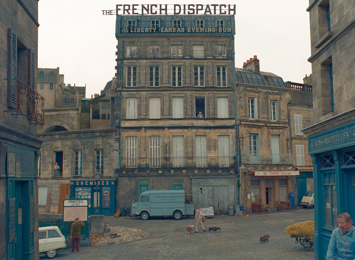
Longtime New Yorker archive editor Erin Overbey wrote an article breaking down how Anderson’s French Dispatch of the Liberty, Kansas Evening Sun and its contributors stand up to the source material.
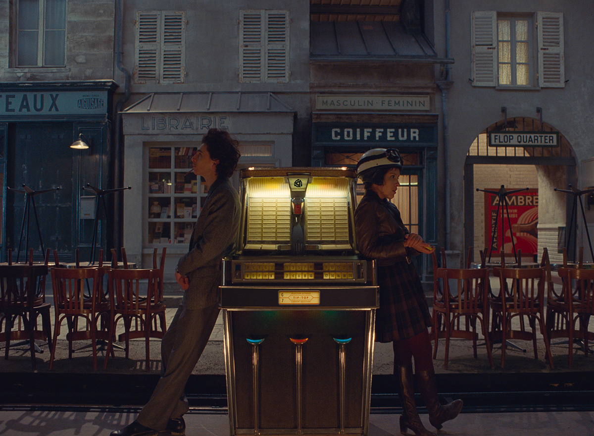
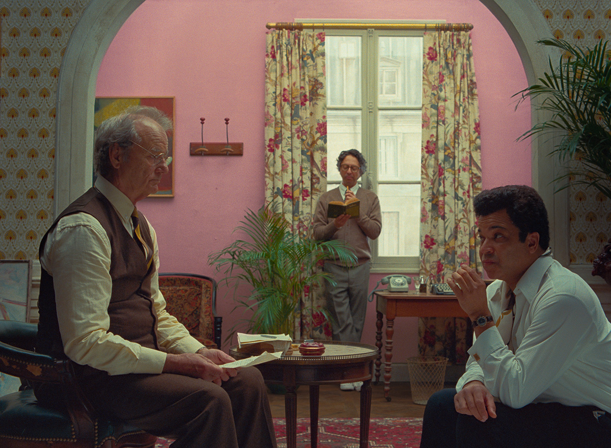
Overbey approves of the film’s ambiance and surroundings. “Anderson studied New Yorker covers in detail, and his depiction of the magazine’s offices, though admittedly outsized, feels in some minute ways uncannily familiar, even though the filmmaker has never seen them in person.”
Although Overbey stipulates that the layout of the office is reminiscent, but wrong in scale and tone, she appears to validate the choice. “Whereas the magazine’s physical spaces back then might not have been as colorful as those in the film, the personalities inside them certainly were.”
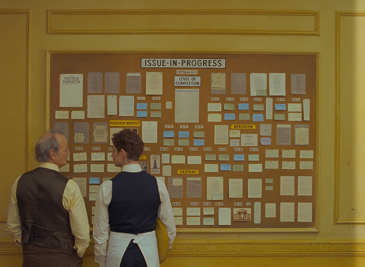
For example, Owen Wilson’s ever-cycling journalist Herbsaint Sazerac is clearly based on Joseph Mitchell (although the bicycle is apparently true to Wilson’s own proclivities). Mitchell famously wrote an essay ostensibly about the rats of New York. In the movie, Sazerac’s role is to tour Ennui-sur-Blasé and thereby unconventionally set the scene for viewers in the same way that Mitchell did for early New Yorker readers.
The character of Lucinda Krementz, played by Frances McDormand, is a composite of longtime New Yorker contributors Lillian Ross and Mavis Gallant. One of Gallant’s most famous reporting pieces was translated into McDormand, Timothée Chalamet and Lyna Khoudri’s youth movement plot (which Susan Morrison says “feels like the heart of the movie”).
Jeffrey Wright portrays a gourmand named Roebuck Wright, drawn from A.J. Liebling and James Baldwin, a combination that produces a compelling “sense of stillness and a leisurely, ruminative quality” for the character.
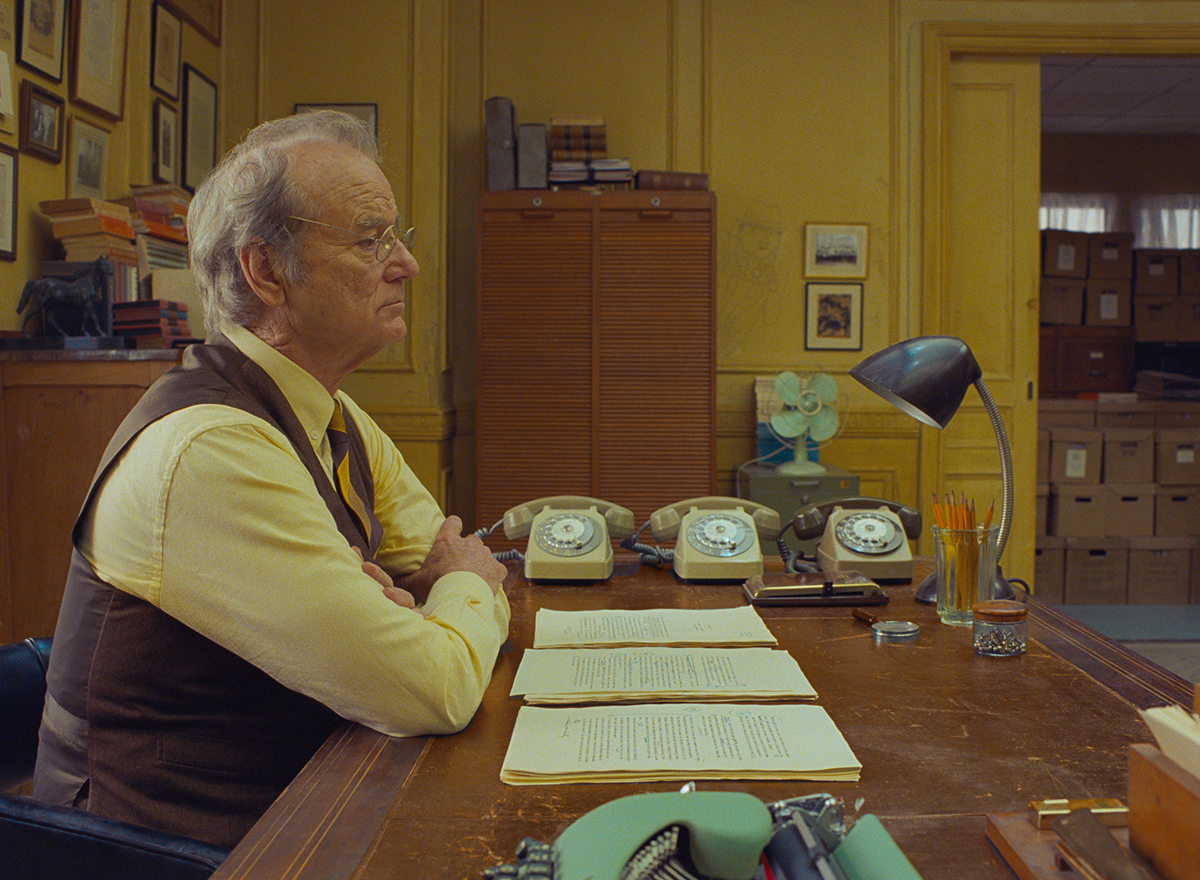
And then there’s Bill Murray as Arthur Howitzer, Jr., the French Dispatch editor-in-chief who is an amalgamation of New Yorker progenitor Harold Ross and its second editor, William Shawn. Overbey describes Howitzer as “a highly nuanced cross” between the two men.
Anderson puts it this way: “Bill Murray’s character has a bit of the surface of Ross and more of the feeling of Shawn, which is really that he’s so deeply protective of these writers.”
Overbey also asked David Brendel for his take on how the movie compares to the real thing; Brendel edited “An Editor’s Burial.”
“This is a world where all of the eccentricities are preserved,” Brendel tells Overbey, “and it’s as if the magazine’s offices and culture back then were as colorful as its covers.”
Regarding the magazine itself, Overbey has a few qualms with the depiction. “There are many things that the filmmaker gets right, as well as a few that slightly miss the mark (perhaps deliberately so). For example, when the editor-in-chief, Arthur Howitzer, Jr., played by Murray, orders his staff to remove the masthead in order to make more room for a lengthy piece, I let out a cough; The New Yorker, in its ninety-six-year existence, hasn’t published a masthead.”
My own “cough” moment came when McDormand’s Krementz referred to mistakes on a handwritten manifesto as “typos.”
READ MORE: The New Yorker Writers and Editors Who Inspired “The French Dispatch” (The New Yorker)
A.O. Scott’s New York Times review of the movie pushes back on Searchlight’s marketing, which calls it “a love letter to journalism.” (I’m strongly inclined to agree.)
Rather, Scott writes, “The movie is not Wes Anderson’s version of Spotlight, in which humbly dressed reporters heroically take on power, injustice and corruption. Moral crusades are as alien to Anderson’s sensibility as drab khakis. What The French Dispatch celebrates is something more specific than everyday newspapering and also something more capacious. Anderson has inscribed a billet-doux to The New Yorker in its mid-20th-century glory years that is, at the same time, an ardent, almost orgiastic paean to the pleasures of print.”
Additionally, Scott characterizes Anderson as “the most passionately literary of living filmmakers,” not only for the inspiration that he takes from his bookish inclinations, but in the manner in which he approaches his craft. For Scott, “Anderson uses the tools of cinema to approximate the experience of reading.”
“Anderson uses the tools of cinema to approximate the experience of reading.”
— A.O. Scott
Scott concludes that Lois Smith’s Upshur Clampette, along with “Howitzer and the various misfits who turn up in Ennui represent an ideal of down-to-earth American cosmopolitanism, an approach to writing, culture and the world that is at once democratic and sophisticated, animated by curiosity and leavened with irony. The movie is a love letter to that spirit, and also a ghost story.”
None of this is to say that Scott believes The French Dispatch will be for everyone. “Anderson isn’t really a polarizing figure; there isn’t much to argue about. He’s a taste you either enjoy or don’t, like cilantro or Campari.”
READ MORE: ‘The French Dispatch’ Review: Remember Magazines? (New York Times)
Not So Accidentally Wes Anderson
Anderson’s signature cinematic look has inspired a book, a website, and an Instagram account all dubbed “Accidentally West Anderson” (and kicked off many quirky projects), but Anderson claims his own visual style is somewhat more aleatory than you’d expect.
For more on the “making of” Anderson’s distinctive visual style and how filmmakers determine which aspect ratio to use for their films, read When and Why to Shoot 4:3.
Anderson’s visual style remains consistent as time goes by, Cassie da Costa writes in Vanity Fair, but his narrative style has become more restrained.
“Where Rushmore and The Royal Tenenbaums included multiple beats of emotional disclosure — immediately endearing us to each film’s fairly pathetic protagonists — Budapest and Dispatch tease out an emotional landscape with subtlety in dialogue and gesture,” she explains.
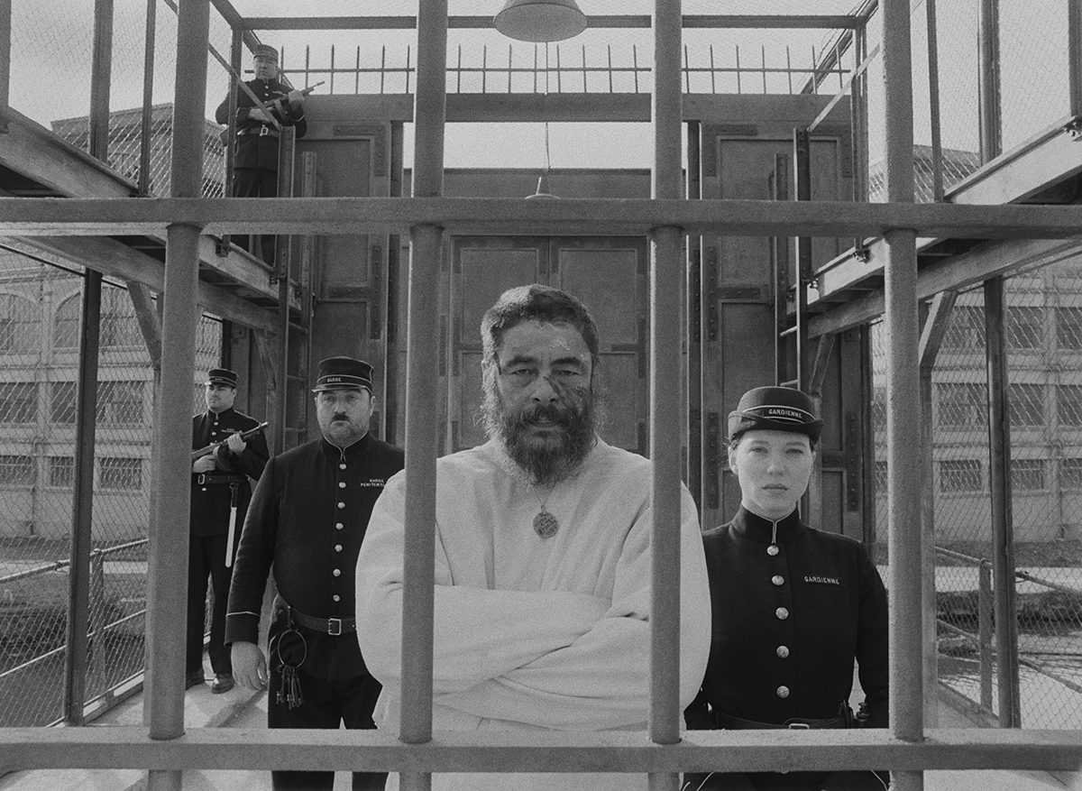
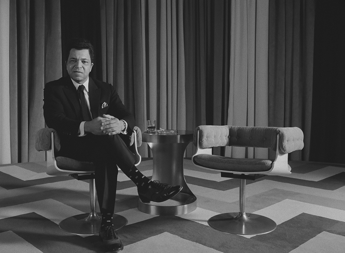
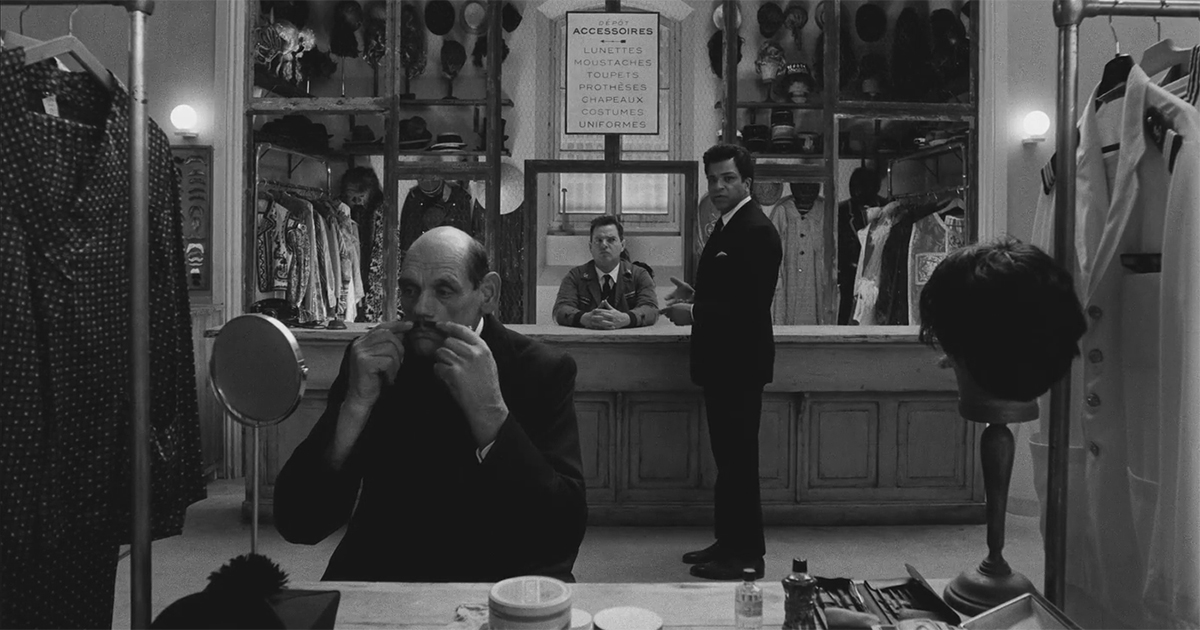
“It’s easy to perceive this maturation as a loss of depth, since traditional Western storytelling structure compels us toward emotional release—but even in Anderson’s later films, there’s still so much happening onscreen beyond what characters say or show on their faces. Over the course of just one vignette in Dispatch, del Toro’s blank expressions are carefully layered with strokes of color as the ruthless art world assembles around him and his muse, Simone (Léa Seydoux). There’s a literal layering too: Throughout this vignette, black-and-white images are interrupted with flashes of color. Look away for an instant, and you might miss an unfolding architecture of human complexity, with nearly every moment building up to some deeply personal revelation.”
READ MORE: Wes Anderson’s Signature Style Isn’t Only Skin-Deep (Vanity Fair)
This is not the only aspect of the movie to “unfold.” The finale, which is bound to win a place among future top ten “long take” lists, is a seamless tracking shot that takes us through various rooms of the police station, including a shooting range and a gymnasium, ending with Roebuck taking a wrong turn into solitary confinement, where a mobster’s accountant (Willem Dafoe) is being held. Incongruous if watched in isolation, Roebuck discusses a police chef’s cooking throughout the scene.
Writing for Vulture, Matt Zoller Seitz said Anderson wanted this showstopper sequence to unfold in a single continuous motion. “Smooth and tight. No shake, no drift. No cheating. He wanted everything done on dolly tracks.”
Anderson’s key grip, Sanjay Sami, said the “quietly impossible” 70-second tracking shot, which included multiple right angle course changes, pushed him to the limits of his ingenuity.
“When I got to that part of the script, I thought maybe I was reading it wrong,” Sami added, “because there was no way you could do a dolly shot that long and that elaborate without a cut. I wrote an email to Wes and said, ‘It looks like one shot.’ He said, ‘That’s because it is.’
“There is a level of exactness to Wes’s dolly shots that cannot be achieved with a handheld camera, even a Steadicam,” Sami continued. “The precision Wes demands is so great that you have to put the camera on tracks to get the effect that he wants. The stability, the rigidity, of a dolly is what makes it a Wes Anderson shot.”
The entire shot was created from scratch in four weeks on the production’s principal soundstage, an abandoned felt factory in Angouleme, France. Dollies were stacked on top of dollies and pins upon pins to free up pieces of track and achieve the three 90-degree direction changes required to navigate the space. Jeffrey Wright nailed Roebuck’s lines on the first take.
“Anderson’s tracking shot through the police station is the moment when all of the exposition that got us to this point starts to recede and his film morphs into a comedic action thriller,” said Zoller Seitz. “The totality of shots like this [represent] the ultimate expression of Anderson’s increasingly animation-influenced aesthetic.”
READ MORE: ‘You Just Have to Accept That Wes Is Right’ The French Dispatch crew explains how it pulled off the movie’s quietly impossible tracking shot. (Vulture)
The French Dispatch editor Andrew Weisblum, ACE spoke with the Art of the Cut podcast’s Steve Hullfish about his mist recent collaboration with Anderson.
Weisblum has a lengthy list of credits, including The Darjeeling Ltd., The Wrestler, the ACE Eddie-nominated Fantastic Mr. Fox, the BAFTA-, ACE Eddie- and Oscar-nominated Black Swan, the ACE Eddie-nominated pilot for Smash, and the ACE Eddie-nominated Moonrise Kingdom, He also served as supervising editor on the ACE Eddie-nominated Isle of Dogs, and edited the upcoming Lin-Manuel Miranda feature, Tick, Tick… Boom! alongside Myron Kerstein, ACE.
“We began filming at the end of 2018 into 2019, and the editing process went through all of 2019 and a little bit into the very beginning of 2020 just finishing up the DI and visual effects,” Weisblum told Hullfish. “The original plan was for it to be released in May at the Cannes Film Festival 2020, but obviously, that didn’t happen. So, cut to a year plus later and now it’s getting released.”
Weisblum also discussed the unusual aspect ratio of The French Dispatch. “It’s mostly 1:33, but it does pop to ‘scope [2.39:1] a few times,” he said. “We started to play around graphically with split screens where we had a larger image in a smaller side subtext image and we moved the images around. Then, we start to play a lot graphically with texts either on the image or alongside the image — kind of like a magazine, but not too literally in that sense.”
READ MORE: Art of the Cut: Wes Anderson’s Latest Tableau, “The French Dispatch” (Art of the Cut)
The magazine format provided opportunities for Weisblum to play with various layouts, just like a real magazine has specific layouts for each department that cohere into a visual whole.
“There’s that and the switching between black-and-white and color, which was constant and fluid,” he said. “As I recall, when we originally started shooting, more of the film was going to be in color, but we started primarily with the Rosenthaler story, and Wes, in particular, was loving all the black-and-white. So, more of the other stories took on the black-and-white and the color was used as punctuation or emphasis instead of entire sequences or entire stories.”
Listen to “Art of the Cut, Ep. 136: The French Dispatch Editor Andrew Weisblum, ACE” in the audio player below:
Want more? In this video essay, Thomas Flight examines how Wes Anderson has heightened his style in The French Dispatch to what he calls an almost absurd level:
It’s impossible to miss Wes Anderson’s signature style, because his films — whether they’re from original scripts or adaptations — are dripping with the director’s striking trademark visuals. But what makes it his, and why is it so prominent in all his films? In this video essay, StudioBinder dives into Anderson’s aesthetic, breaking down his incomparable style into seven key categories: story, production design, color, cinematography, editing, sound design, and music.
You can also check out this behind-the-scenes look at the film featuring the people who consistently return to work with director Wes Anderson, both behind the camera and in front of it:
The setting of The French Dispatch itself, Ennui-sur-Blasé, is another creation straight from the mind of Anderson. His long-time collaborators, production designer Adam Stockhausen and model maker Simon Weisse, are the ones who brought the creation to life, however. With models and miniatures to help populate the scenes, the two share some tricks and secrets with Berlinale Talents:


