By Adrian Pennington & Julian Mitchell
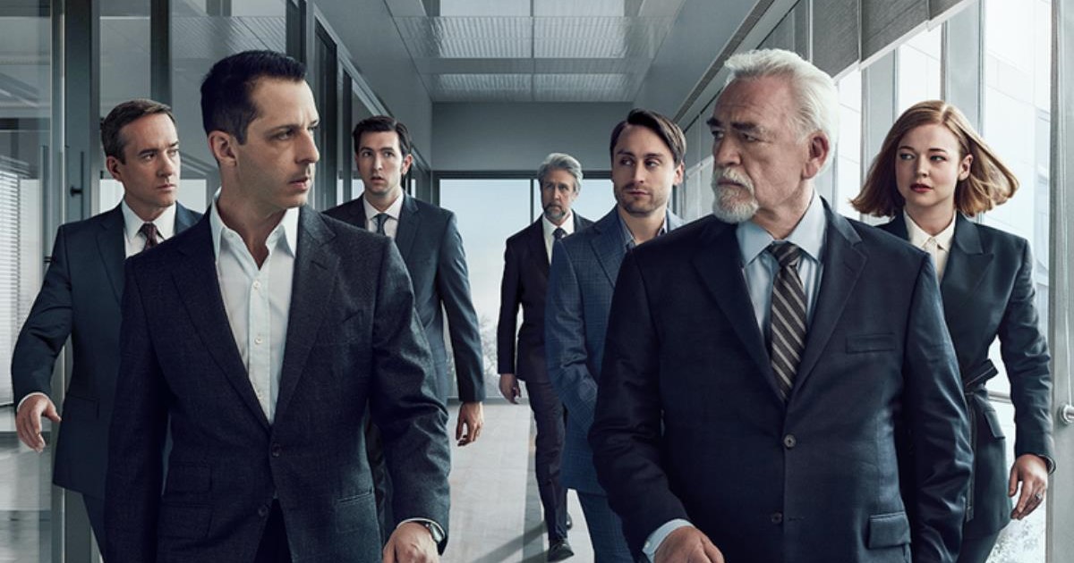
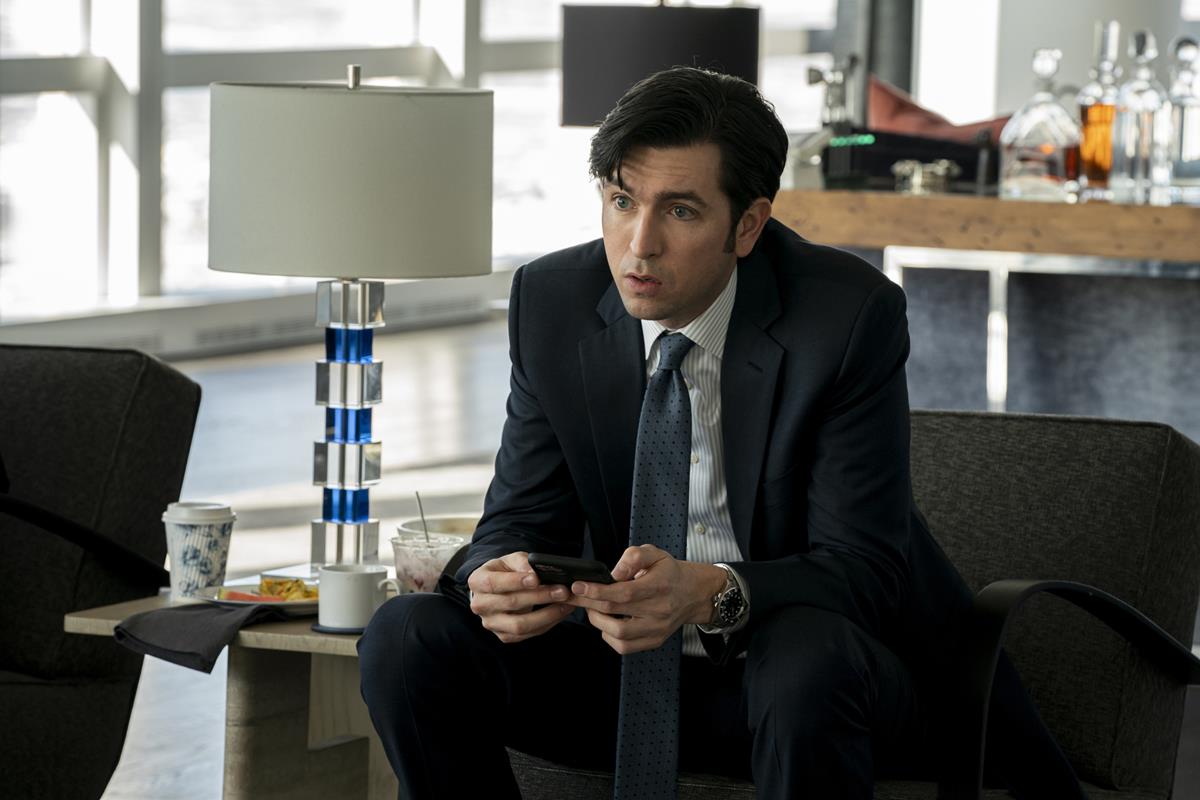
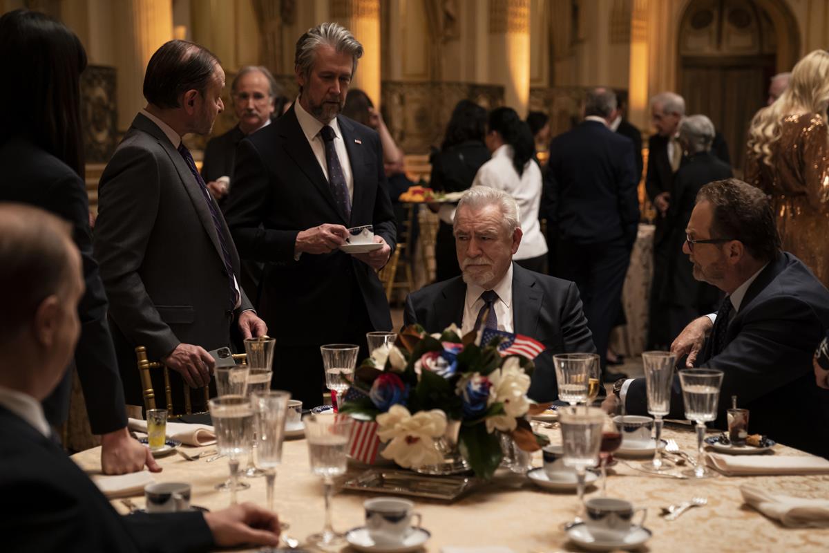
The cinematography of Succession is full of flaws. Yes, one of the most popular and critically acclaimed TV dramas of the moment seems to get away with imprecise framing, characters who block other characters and awkward focus pulls — all the things that in the normal world of TV styling, and especially with the kind of budget HBO puts behind a prestige show like this, would have the camera operators fired.
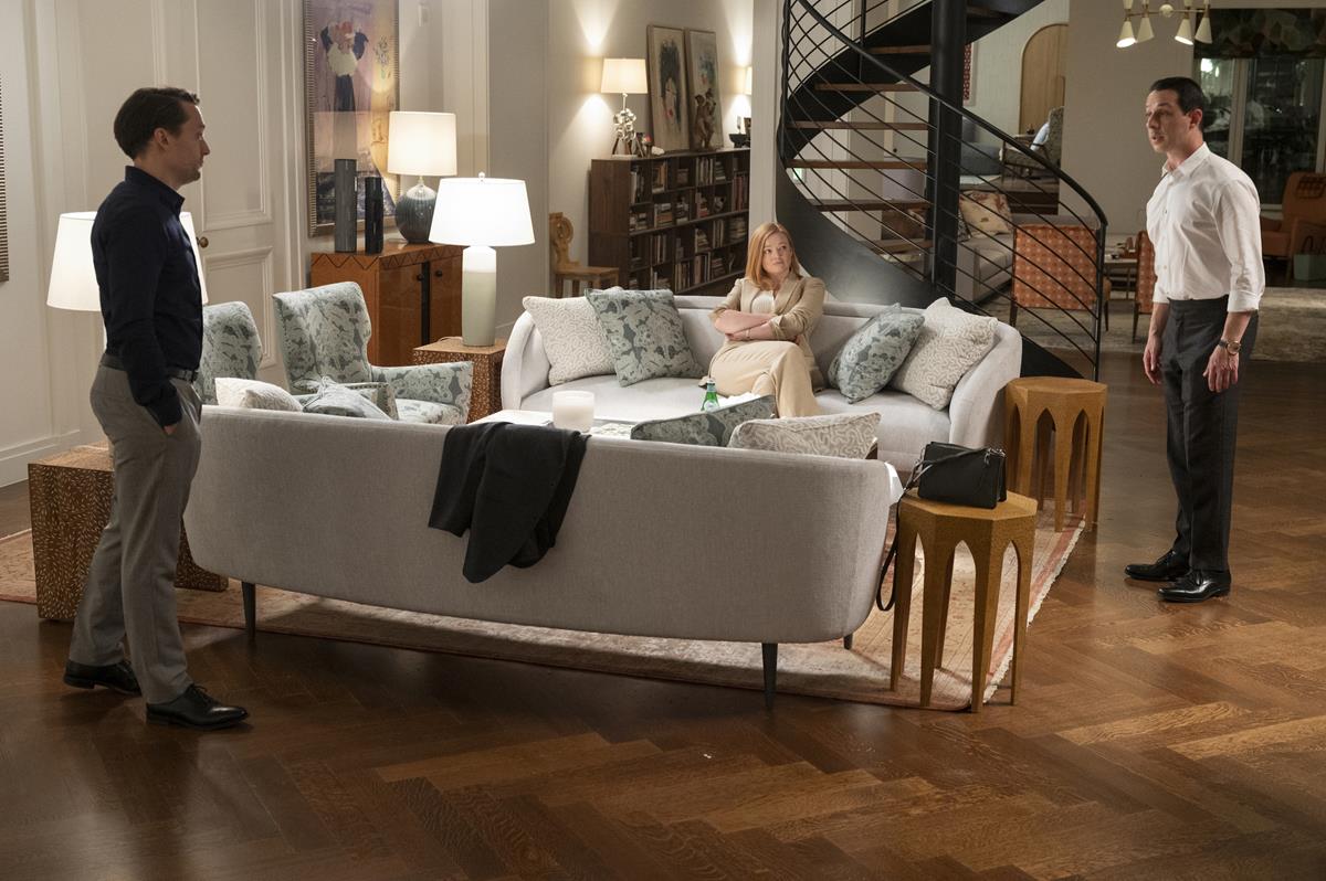
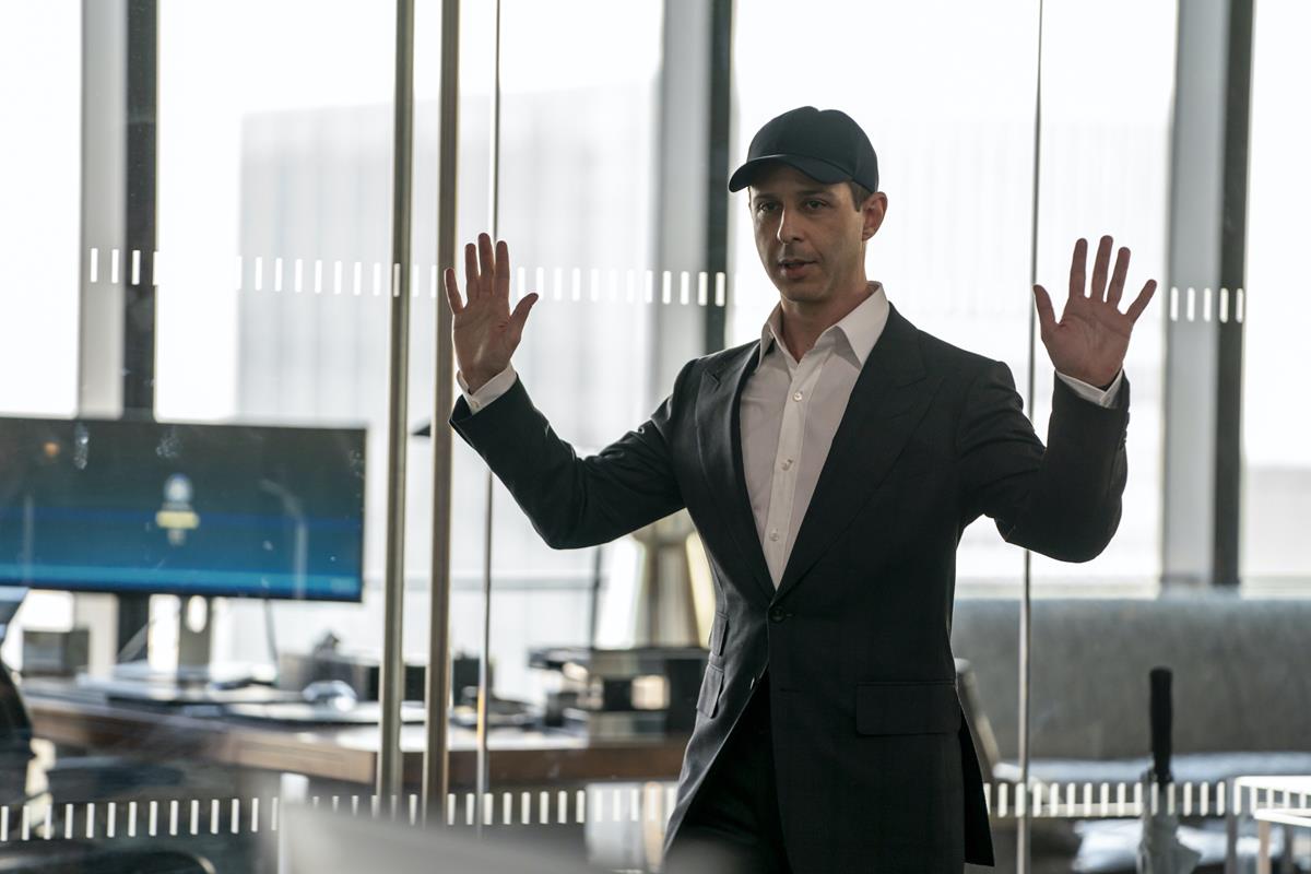
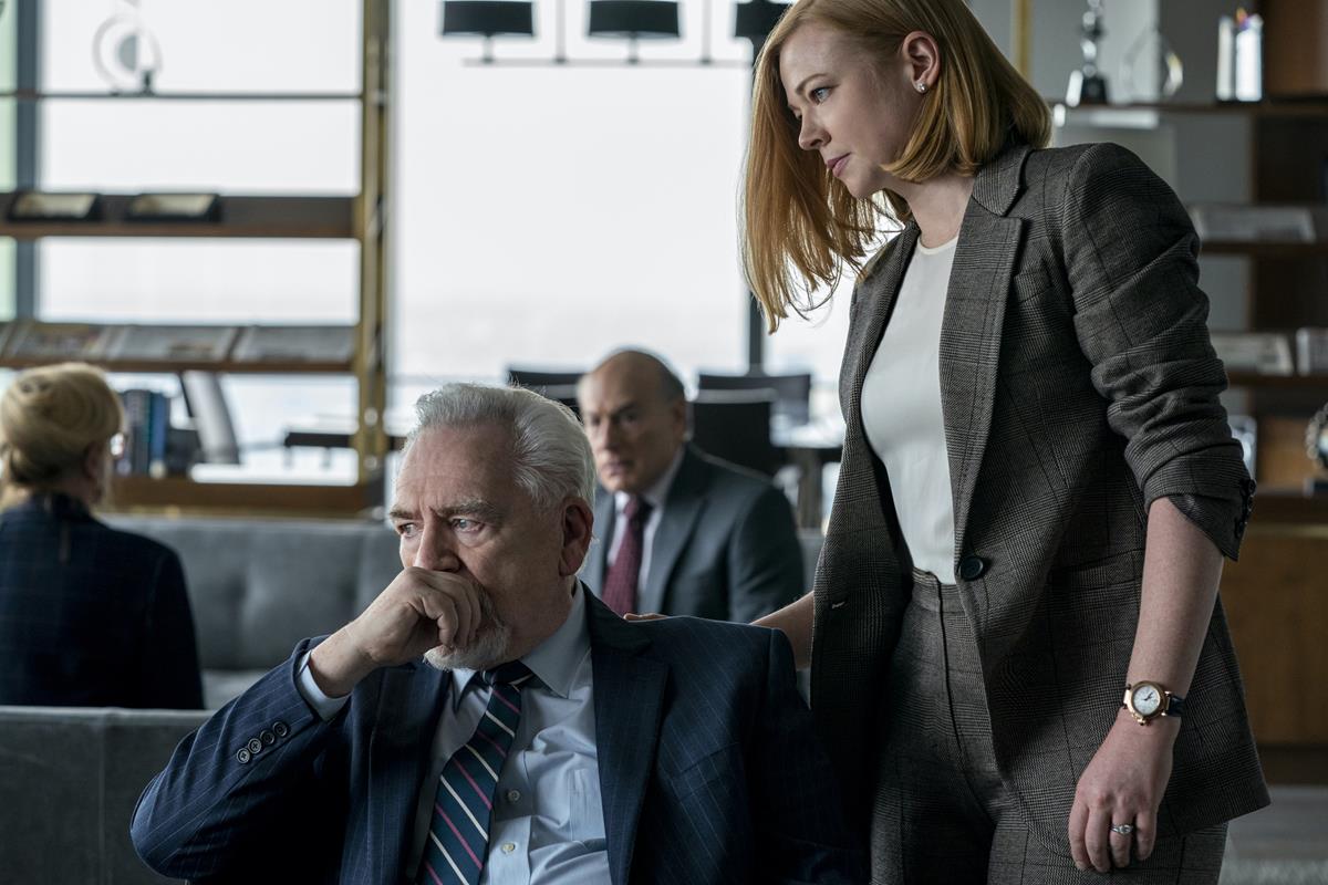
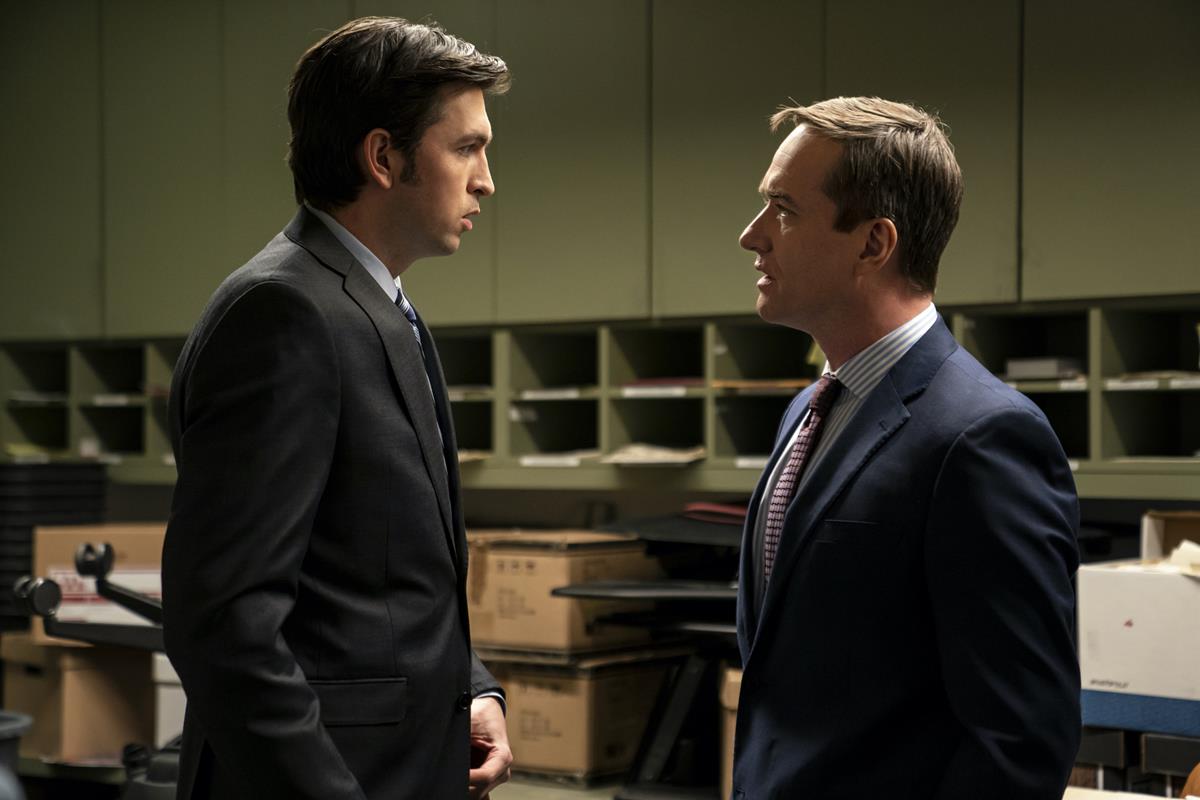
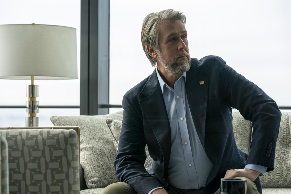
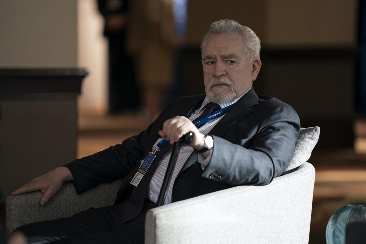
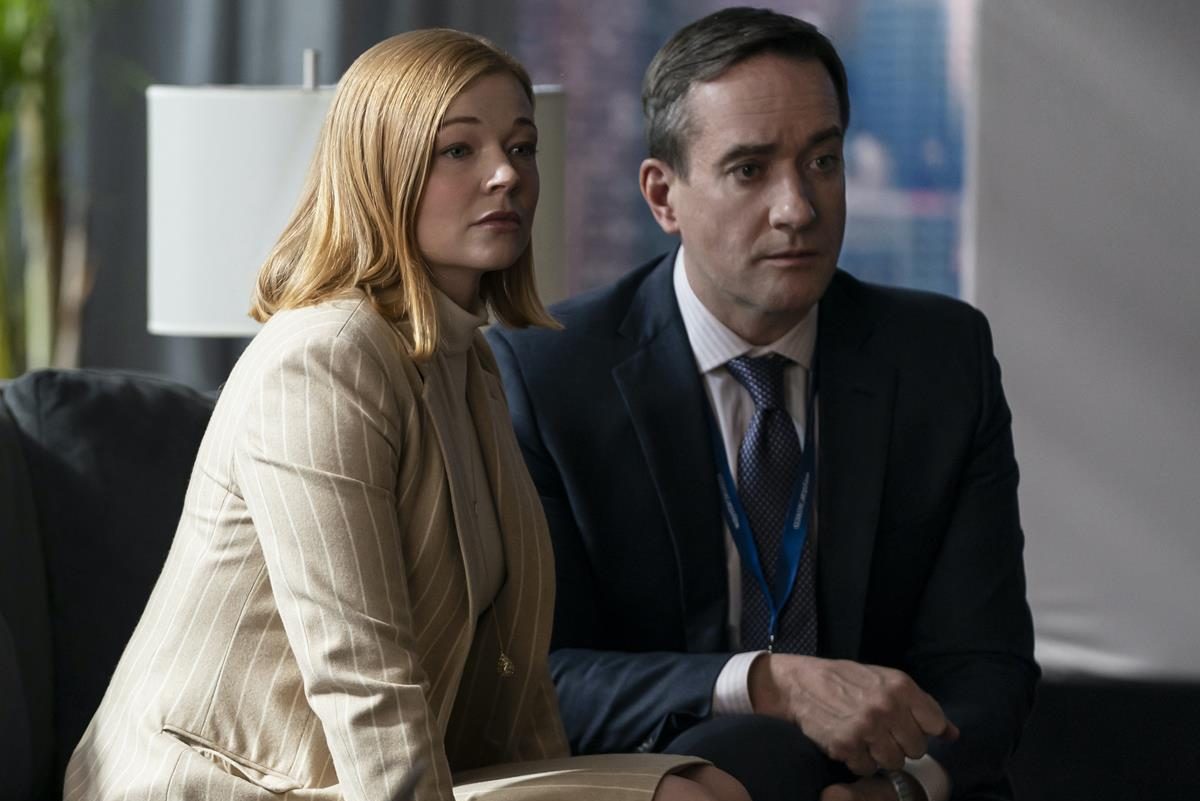
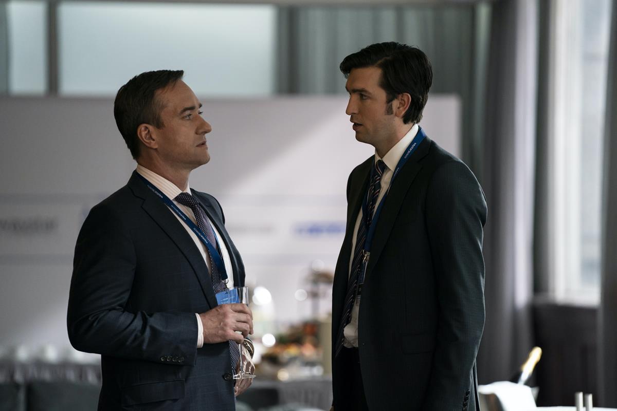
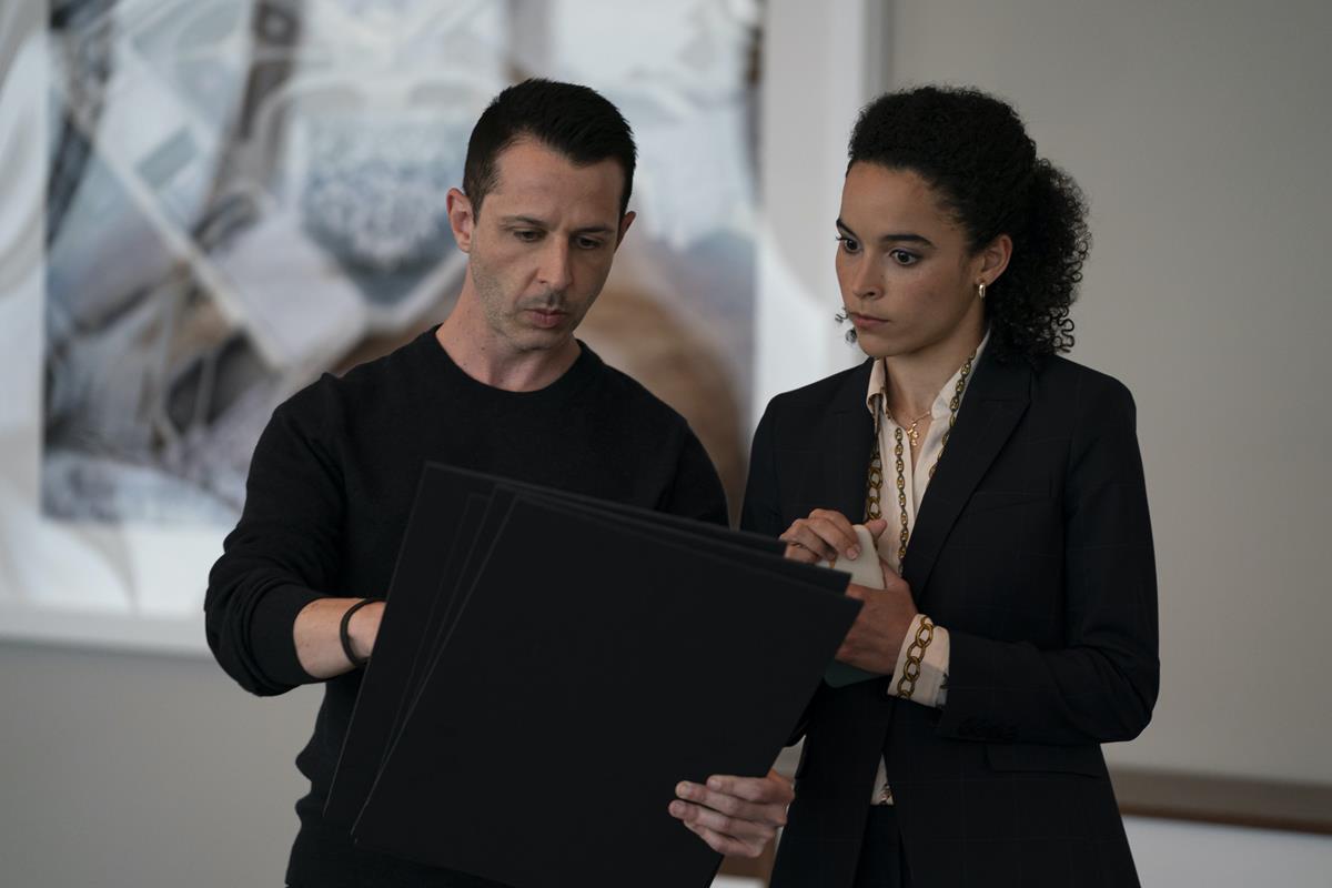
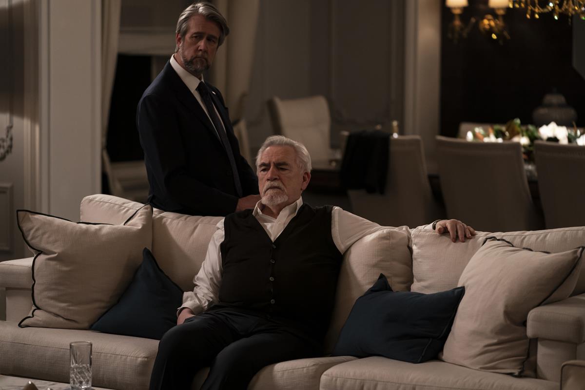
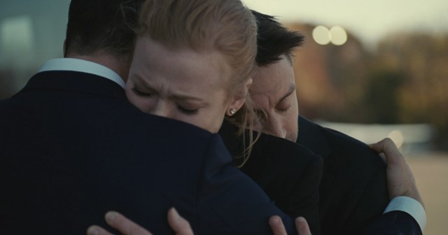
Of course, the flaws aren’t flaws, but carefully designed into the visual grammar of the show. The show is consciously shot as though a real camera were in the room, often at the expense of ideal compositions, and a big part of why that is has to do with how the show treats its camera like it’s a character.
Thomas Flight, a video blogger, has dissected all this in a video:
Since the show is mainly driven by dialogue between various people in a room it could easily be a very formulaic and boring, Flight says. Yet many of these conversations feel tense and exciting. It’s also a show about a group of people who aren’t particularly nice yet you find yourself getting engrossed in their drama. Why?
Because the camera crafts a character that doesn’t exist consciously on screen, but one that sits in the unconscious mind of the viewer that aids in the telling of the story.
This style of cinematography isn’t new. The pilot to the series is titled “Celebration,” which is a reference to the 1998 Danish film Festen (The Celebration) made by director Thomas Vinterberg. Festen was the first film in the Dogme95 movement that employed handheld camera work and an approach to filmmaking that attempted to mimic the conditions of documentary filmmaking.
Succession takes cues from Dogme95, cinema verité, and other styles that use documentary techniques to create fictional stories.
“Even though it is not a documentary or a mockumentary the scenes in Succession are still shot as if the camera-operator is in the room with the characters attempting to capture things as if they were real events,” Flight explains.
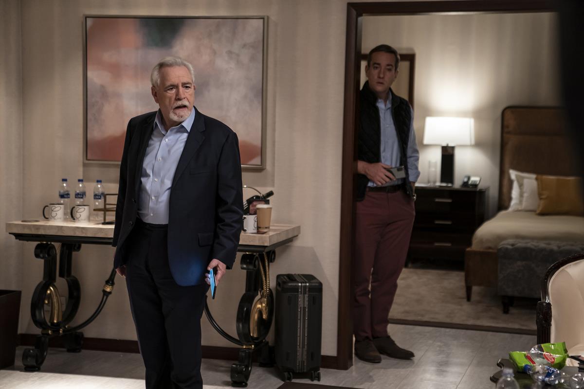
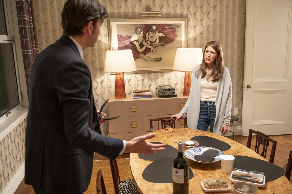
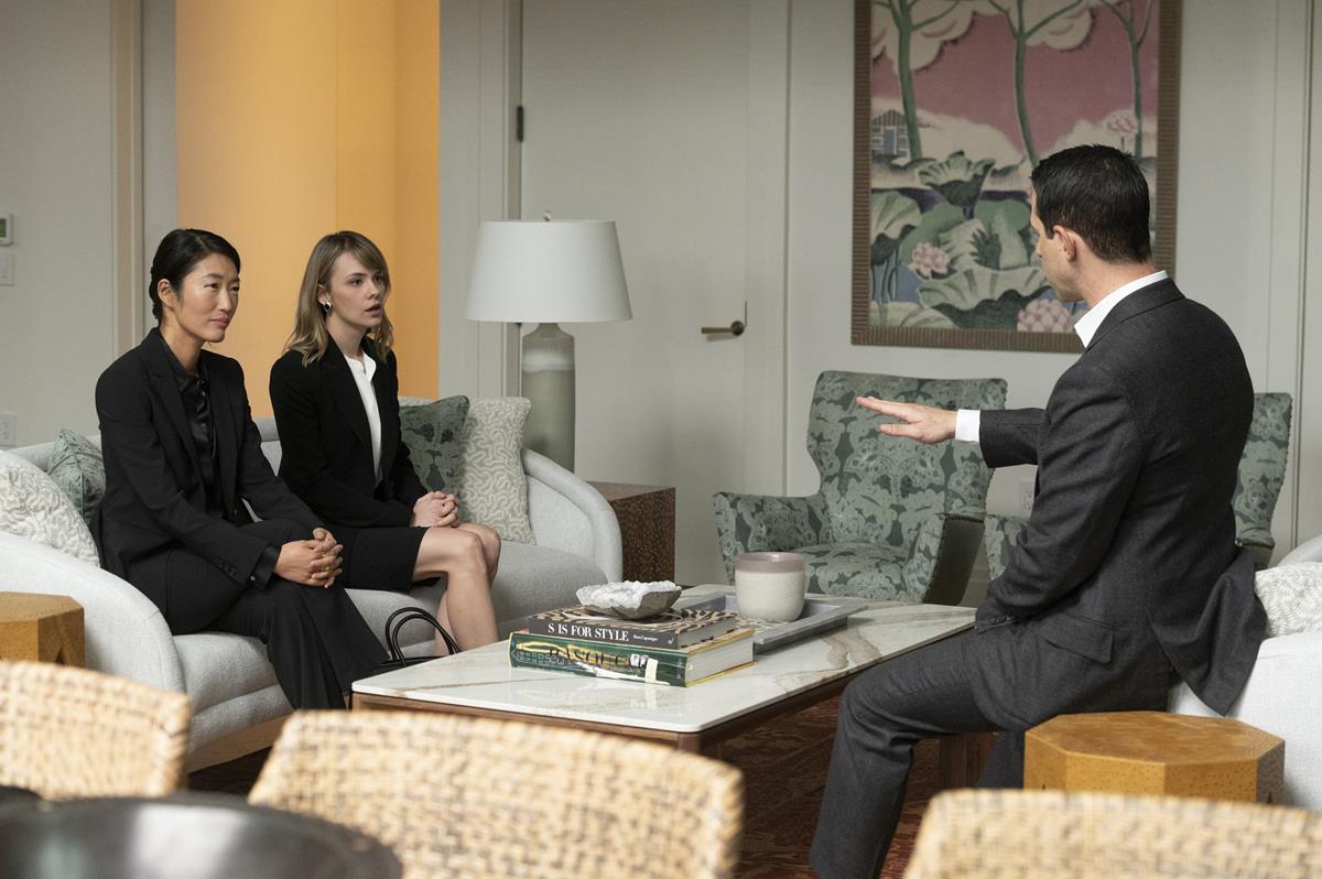
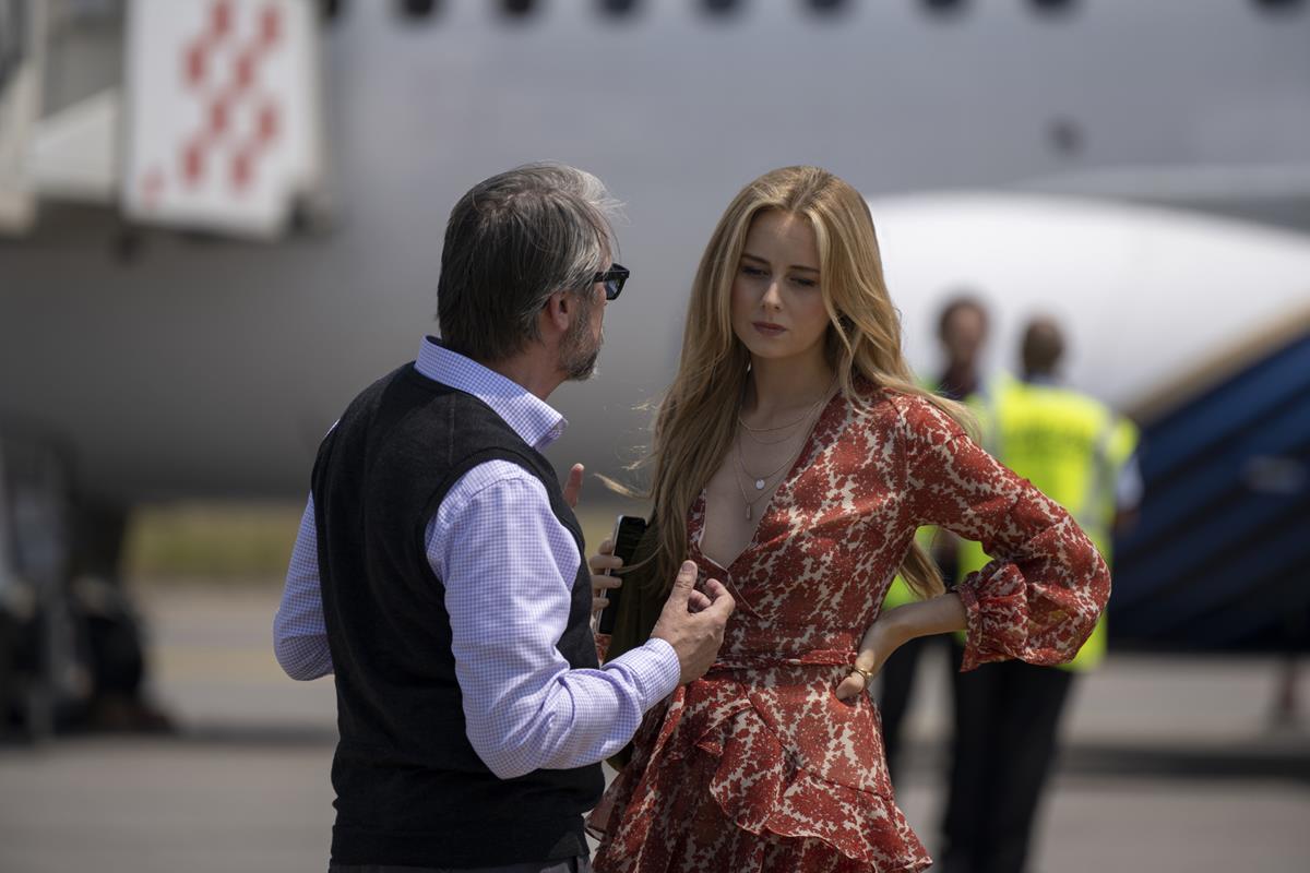
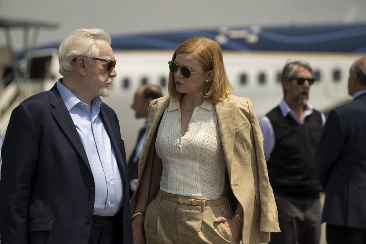
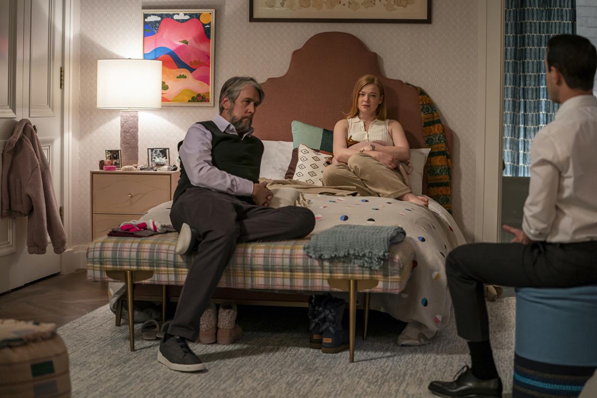
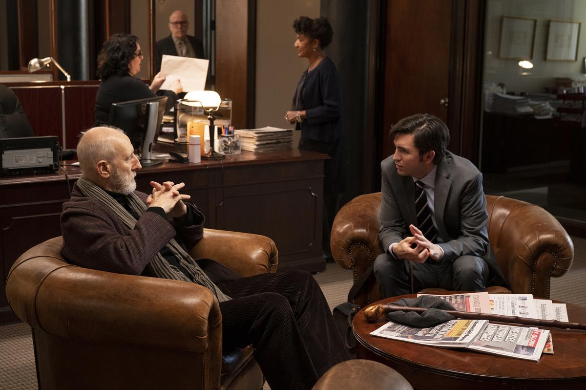
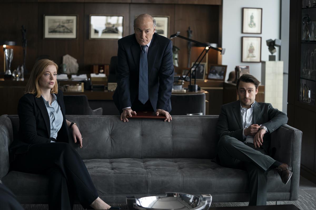
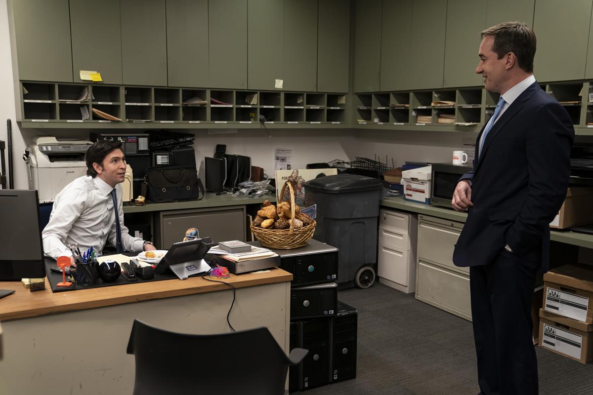
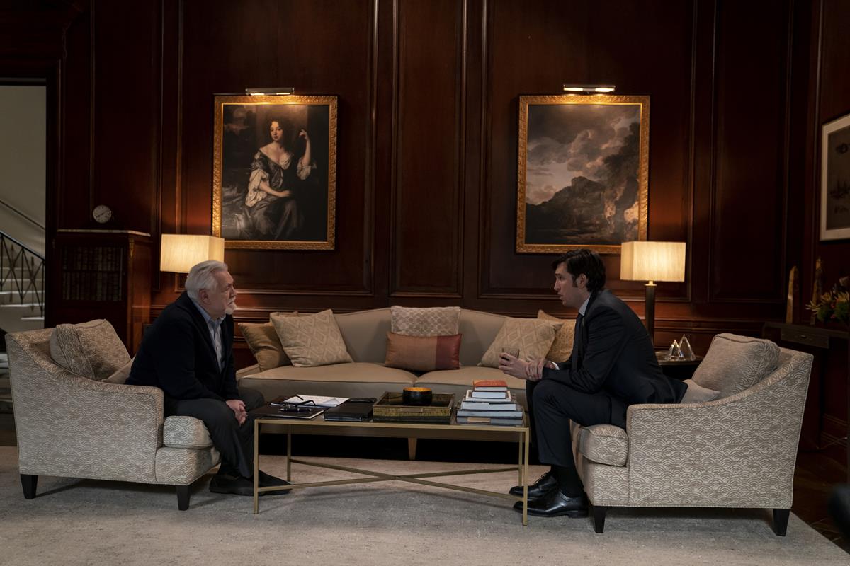
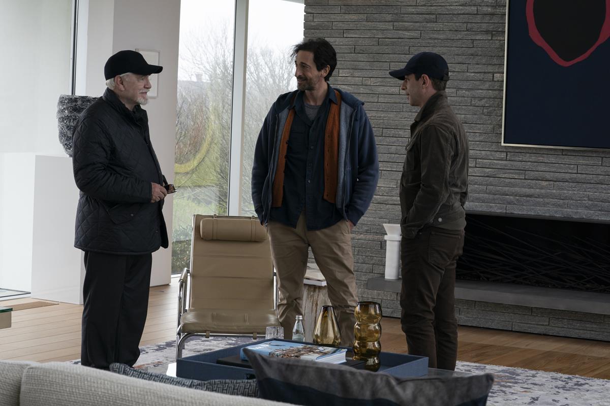
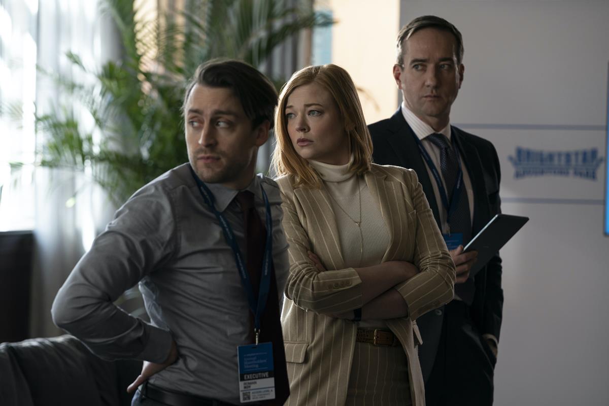
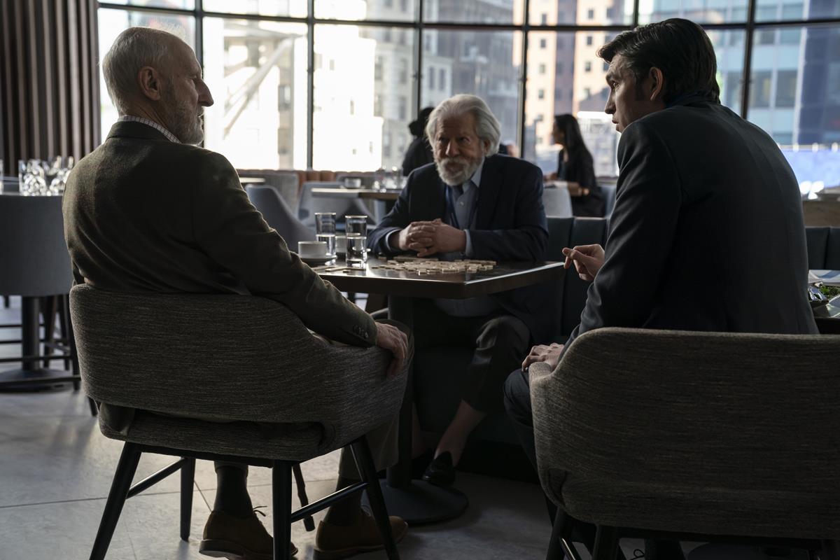
“A more formal narrative show would place the camera between the characters and the actors would pretend it isn’t there. But filming in an ob-doc style the cameras are forced to the sidelines. The camera operators don’t want to get in the way so they end up looking around the people in the room to get the best view. Sometimes the result is less than ideal compositions.”
If it feels like the cameras are actually in the room, it also feels like there’s an actual person operating them in that room. They are not just objective floating observers. Where they look and how they move has a subjective motivation and personality to it, Flight contends. This creates the opportunity for the character of the cameras to express itself.
Flight says the camera acts like a player in the game being played on screen.
Succession is about the schemes and machinations of the family as they each try to achieve what they want. It’s like a game. They have strategies and they talk about making “plays.” The board of this game are the spaces on screen and the conversations between characters. Often the goal is to accomplish what they want while hiding their true intentions.
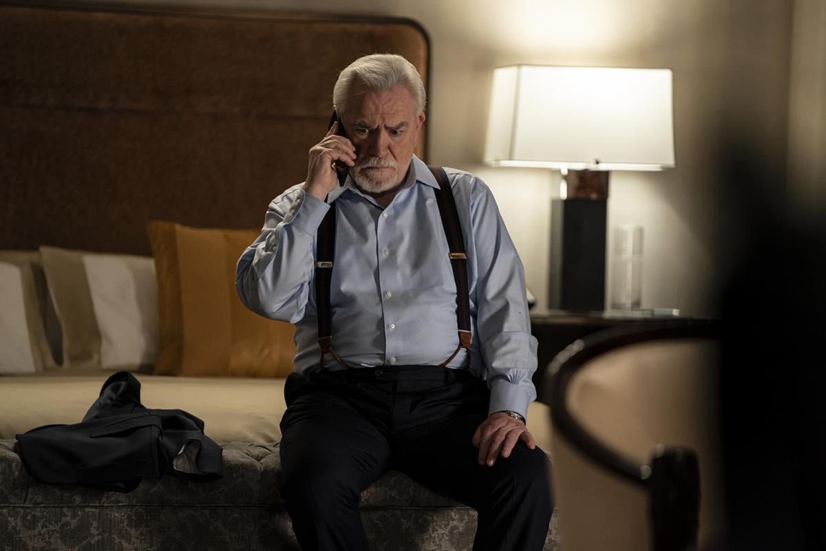
“The actual lines the characters say are often meaningless while the real meaning is in the looks and glances and expressions of characters caught off guard by the camera in the room.
“All the players know they are playing this game so each character is also trying to understand what the other character’s hidden motivations are. Reactions, hidden subtle expressions, body language are all clues that the character and the audience can use to understand what the character really wants or really means.”
In the same way the characters in the scene are scanning each other for clues that betray their real intention, so are the viewers and the camera operators in the scene.
Patrick Tomasso’s essay on how the camera “lies”
The show’s style doesn’t always stick to these rules. Once the conventions for a show are established you can break those norms to create contrast for a specific impact. For example, the energy of the cameras often matches the energy of the scene. When the family is scrambling around trying to say the right thing, the camera searches and dives as well. In other scenes where the characters feel safe or in control the camera calms down. At times the cameras use smoother movement, dollies or even slow-motion in contrast to the frenetic handheld movement in the other scenes to build tension.
Unlike nearly all of 2021’s high end episodics, the multi-award winning Succession is shot on Kodak Vision3 500T 5219 35mm film (HBO’s The White Lotus is another one from a small bunch).
Succession is shot in 1.78:1 aspect ratio on an Arricam LT and ST both with Leitz Summilux-C and Angenieux Optimo lenses. The 35mm film was scanned to 4K for the DI.
The use of film is usually prohibitively expensive on a multi-location show like this one. But the feeling was that part of the success of Succession is the suspended reality that the medium gives this heightened story of a powerful and vastly rich family in conflict.
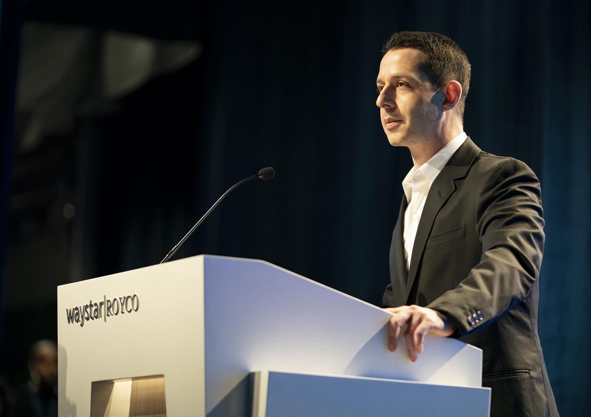
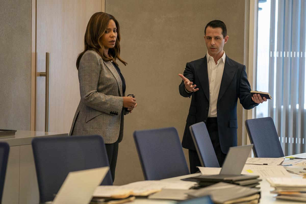
The third season of Succession premiered recently, rewarding fans’ anticipation and continuing to chart the mutually destructive conflicts of the Roy family as they scramble for control of their patriarch’s media empire as his health starts to fail.
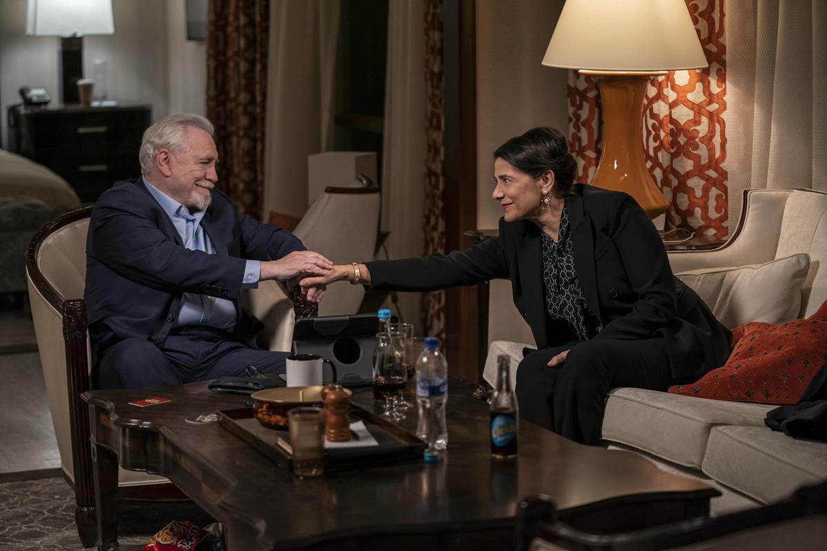
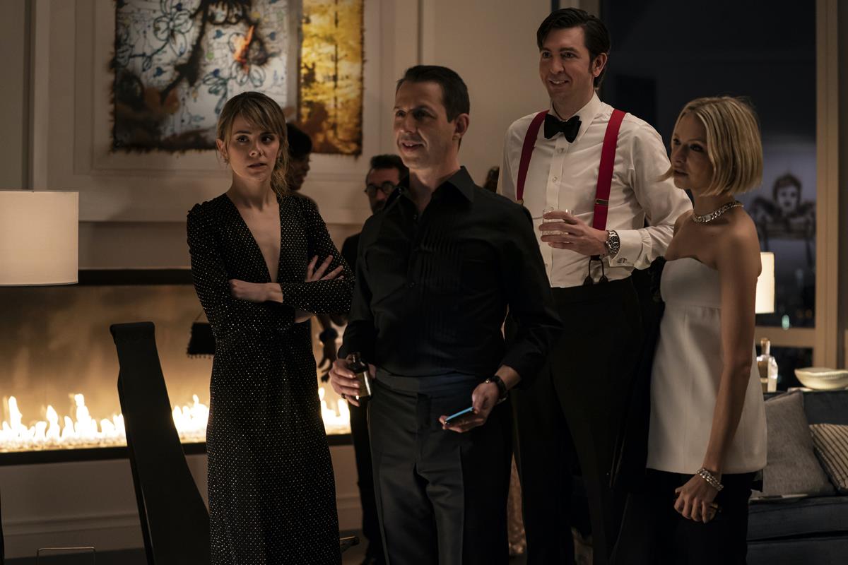
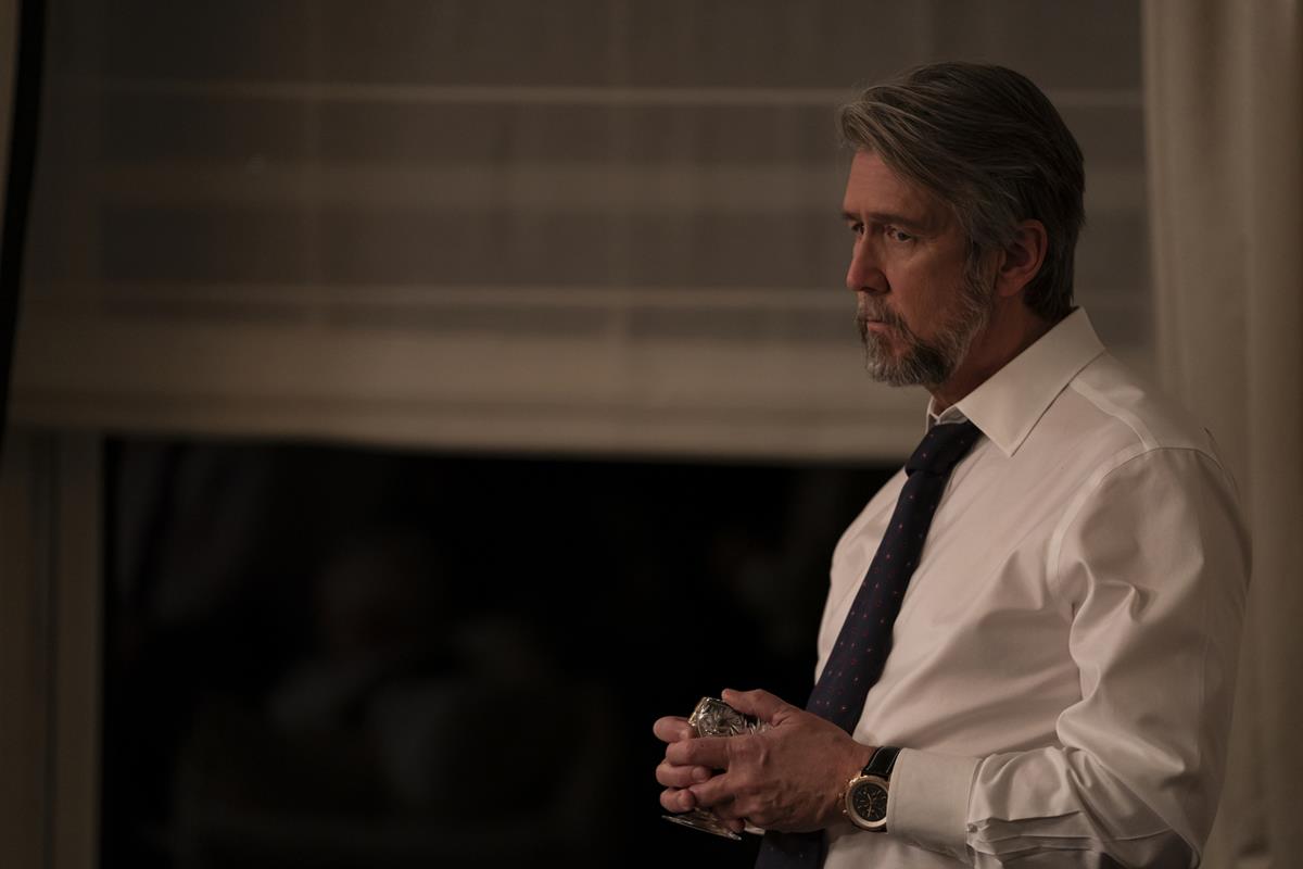
For Season 3, it had to be more of the same as far as the look was concerned. Light Iron colorist Sam Daley has been on the show since the pilot and agrees that the use of film was vital to the tone of the series. “A proprietary film print emulation LUT is used in the grade to maintain the look of film.”
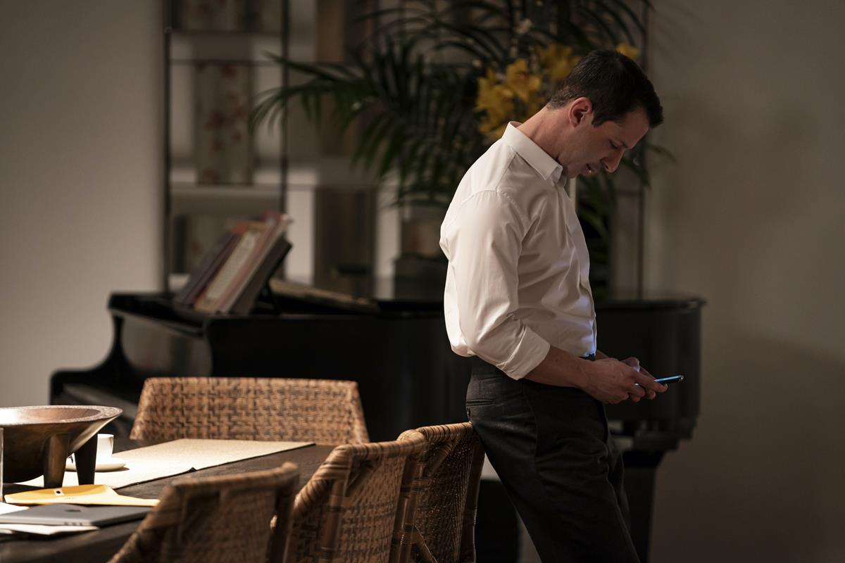
From that pilot episode, cinematographers Patrick Capone and Christopher Norr had used “underexposure to soften the contrast.” But that wasn’t the only way that the show’s aesthetic distinguished itself as Daley further explained.
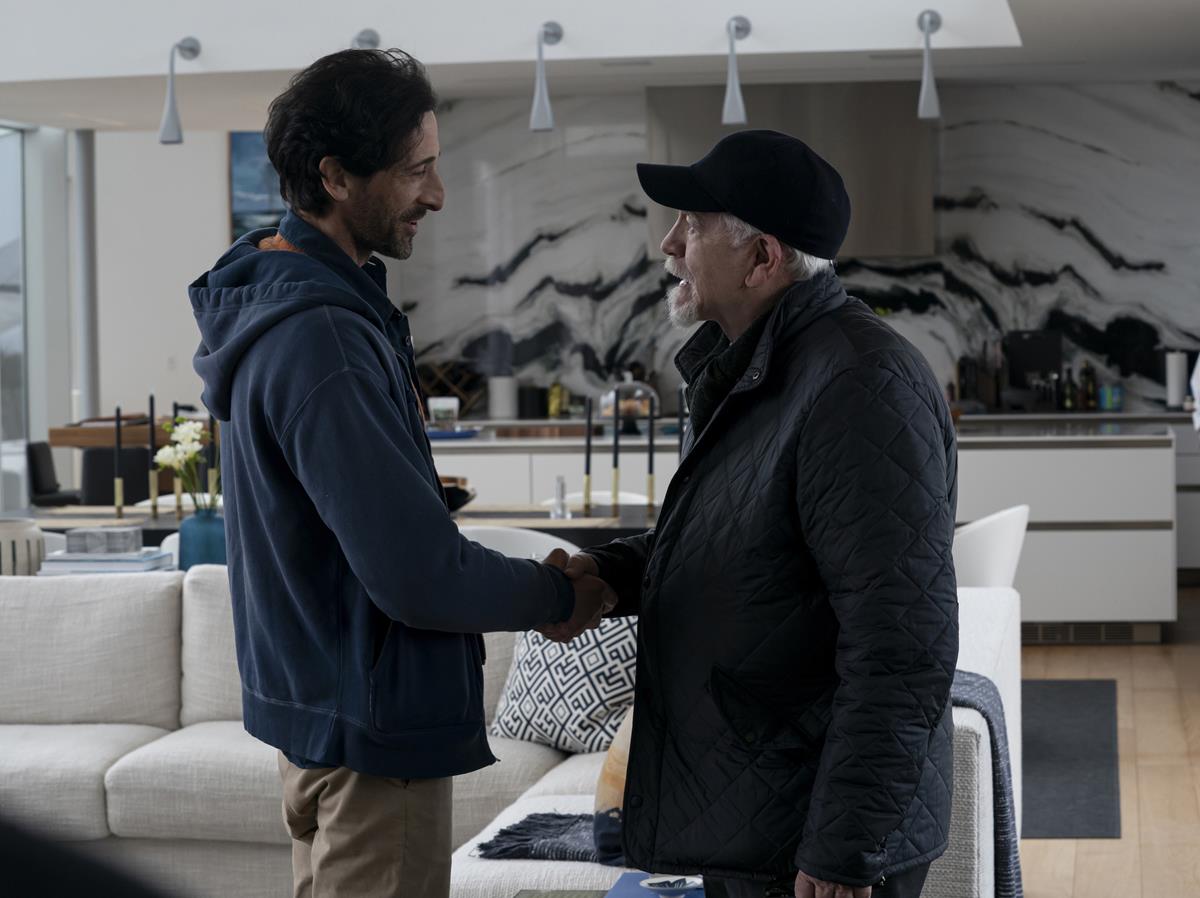
“Succession’s camera style is iconic,” Daley continued. “Handheld, snap zooms, searching, finding the actors rather than placing the camera in front of them. This lends a documentary style to the popular HBO dramedy.
“You’re a fly on the wall watching the Roy family scheme with and against each other. But there are Shakespearean moments as well, so the look of the show is rooted in both realism and classicism.
“Cinematographer Andrij Parekh and I established this look in the pilot, and series cinematographers Patrick Capone and Christopher Norr have skillfully maintained this throughout some of the most challenging situations of any episodic show on television.
“Staying true to the analog tone and texture of film is vital to the look of the series, so I approach the grade as if I’m in a telecine environment,” the colorist added. “I work very hard at finding the right primary grade with just offset and lift-gamma-gain.
“I use secondaries sparingly as too much artifice would distract from the realism. The beauty is already there in the negative, you just have to dial it in and let the story and performances take center stage.”





Discussion
Responses (1)